Modern Software
Products need not be user centered
We've used the word 'user-centered design' infinite times, over and over again. We've even forgotten why we use it.
Putting the user first has always been the golden rule in design. It’s so common that nobody really questions it anymore. We’re told, ‘The user knows best. Listen to them.’
I’ve had my skepticism about the framing of the term — user-centered design. I’ve kept myself from voicing this apprehension, afraid of being dismissed as an outright blasphemy in the design circles. However, having shifted gears from design to PM roles, I feel more comfortable expressing a spicy hot take that — Products need not always be user-centered.
So what’s the problem here with user-centered design?
Imagine you’re crafting a product for Michael Johnson, a fictional character representing the ‘average’ user: a 38-year-old IT project manager juggling work and family life. This approach, while seemingly comprehensive, inadvertently overlooks the diverse spectrum of users with unique needs and preferences. This is the essence of the ‘long tail problem’ as articulated by Kasey Klimes. It states that focusing solely on the average user risks marginalizing those outside this central demographic. The product ends up serving the gaussian middle.
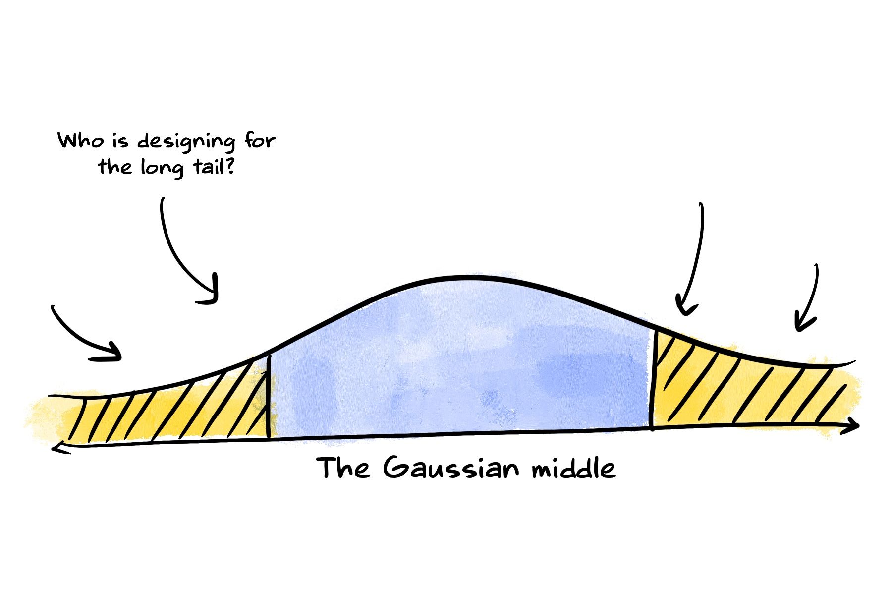
User-centered design by default tends to get optimised for the average. It implies a focus to the right profile of a user. And that’s NOT always the right approach. We just have so much variance in the users, that I sometimes wonder: how do we expand the scope of a product from the gaussian middle to the long tail?
There is a way of addressing the long-tail problem, but it requires a very different paradigm for thinking about the way we design products, tools, and services. We can call this paradigm design for emergence. — Kasey Klimes, Design for emergence
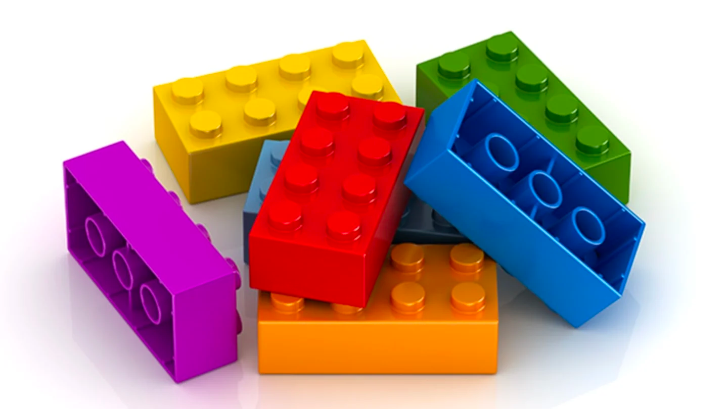
Fortunately, there is a new kid on the block — and that’s design for emergence. This concept finds its roots in Seymour Papert’s emphasis on ‘low floors’ and ‘high ceilings’ in technology. According to him, technology should be accessible for beginners (low floor) yet offer advanced users the scope for complex projects (high ceiling). Think of LEGO, with its simple yet versatile bricks, offering endless creative possibilities — that’s this philosophy brought to life.”
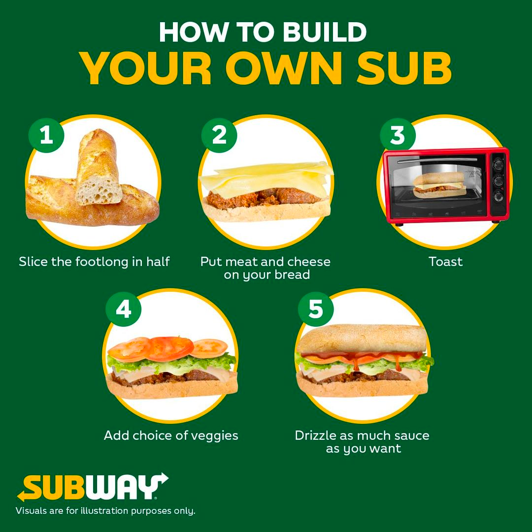
Subway is another example. A sandwich is made composable. You can choose your toppings, the patty, the sauces in a truly unique way. There is no one ‘right’ way for the ‘right’ user. There are multiple ways for multiple users. By designing products with low floors, wide walls and high ceilings, every fringe user can now use the product the way they want it. Even coffee has become ‘composable’ this way.
Designing for emergence is just that. Products with “low floors” and “high ceilings”. Let’s take a couple of digital examples where this has stood out:
Zapier makes automations infinitely composable through its automation blocks
If we classify software in terms of an axes between convention and configurability, on one extreme, you have the DIY types: like Notion built on the principle of composability through content blocks. On the upside, you see people use Notion for all kinds of purposes such as — wiki, project management, CRM, documentation etc. Notion definitely has a high ceiling. However, on the downside, it suffers from ‘too much’ composability leading to featuritis. Features keep getting added, which affects the speed, stability and performance in the core features that defines the essence of Notion (high floor)
Configuration through composability is great. But there are times when you would rather choose a full course buffet curated by a chef, than being given 100 different options to choose and customise on your own. This is where the other extreme lies. Design which chooses convention over configuration. Ruby on Rails is opinionated software, where a team of chefs have picked ingredients on our behalf. As DHH puts it, it isn’t meant to appeal to the taste of everyone, everywhere. This works great when the user doesn’t really know what to look for.
There are lots of à la carte software environments in this world. Places where in order to eat, you must first carefully look over the menu of options to order exactly what you want…Rails is not that.
Rails is omakase. A team of chefs picked out the ingredients, designed the APIs, and arranged the order of consumption on your behalf according to their idea of what would make for a tasty full-stack framework. The menu can be both personal and quirky. It isn’t designed to appeal to the taste of everyone, everywhere.
When we, or in some cases I — as the head chef of the omakase experience that is Rails — decide to include a dish, it’s usually based on our distilled tastes and preferences. I’ve worked in this establishment for a decade. I’ve poured well in the excess of ten thousand hours into Rails. This doesn’t make my tastes right for you, but it certainly means that they’re well formed. — DHH on this blog.
Apparently, it’s not just DHH and Ruby on Rails, but also how Tesla was envisioned by Elon Musk:
This is how we create Tesla products
— Elon Musk (@elonmusk) January 3, 2024
pic.twitter.com/DsmisqDGSp
Taking these different philosophies into account, it would be harmful to consider ‘user-centered’ design as the only way to build products. You can design products in DIY, composable ways as illustrated by LEGO and Roblox. Or in Omakase, conventional way as shown by Ruby on Rails.
Products need not always be user-centered. It can be emergent too, accomodating a varied spectrum of users to use the product.
Pluginisation of Modern Software
Keep the software simple, silly.
Transitioning from Adobe to Figma was a big change for me in my design journey.
At that time, the whole design ecosystem was revolving around Adobe. For image manipulation, you had Photoshop, Illustrator for vector graphics, Indesign for reports, XD for website/app prototypes and so on.
When Figma first started it was competing to disrupt this ecosystem for UI/UX Design. As the adobe ecosystem was offline-first, it turned out to be an expensive design choice. The USP of Figma was centeted around how everyone everywhere could design all at the same time without any latency.
This disruption is widely understood how Figma capitalised on this undue advantage. But one another aspect which gets missed in this whole David versus Goliath battle is ‘pluginisation’.
Opening Photoshop was like being given keys to a space shuttle control panel. You had all the buttons , functions and affordances at your door step. Imagine wanting to ride a cycle and being handed over a Lamborghini. The experience was heavily over engineered for first time users. It violated the (KISS — Keep it Simple Silly) Principle for them.
Compared to the space shuttle, Figma is a bicycle intended for people who wanted to ride a bicycle. However, if the cyclist wanted to upgrade the bicycle, let’s say add extra gears, slope assist, or even a nitro boost, that was possible. It’s a typical textbook case of what we can call as “IKEA effect”
The IKEA effect, named after everyone’s favorite Swedish furniture giant, describes how people tend to value an object more if they make (or assemble) it themselves. More broadly, the IKEA effect speaks to how we tend to like things more if we’ve expended effort to create them.
Everything can be modified and tinkered with. Making users feel more endowed with the software they interact with.
We’re already seeing this in action —- Pluginisation of Modern Software.
Obsidian is already in hot pursuit of this idea. They are encouraging a developer friendly ecosystem of plugins by extending support. Not everyone would be okay with the design choices exercised in a software. The best bet would then be to provide enough resources to the user so that they could customise it on their own.
You have software that can be configured as how ever you want.
Some principles which I follow while doing user-centered design:
- Involving users early in the product development process makes products intuitive and fosters loyalty. It is essential to zoom out and follow a constant process of hypothesis testing, MVP development, review, and refinement. Preparation of research requires a clear goal and involvement of the research team.
- Utilize both qualitative and quantitative methods, such as focus groups, feedback forms, automated surveys, and metrics dashboards. A/B testing enables data-driven decisions by testing specific changes. Usability testing should be scenario-based, with users sitting in front, encouraging them to think aloud.
- Empathy plays a crucial role in understanding user perspectives. Tailor questions based on whether they are asked individually or in a group. Be attentive, consider gender dynamics, and prompt users to share their thoughts and expectations. Observing users and thinking aloud during the observation process yield valuable insights.
- Avoid using “how did you” and replace it with “how would you like to” for a user-centered approach. Debriefing is a vital part of the research process. By incorporating these user testing skills, you can build a strong foundation for user-centric product development and improve the overall user experience.