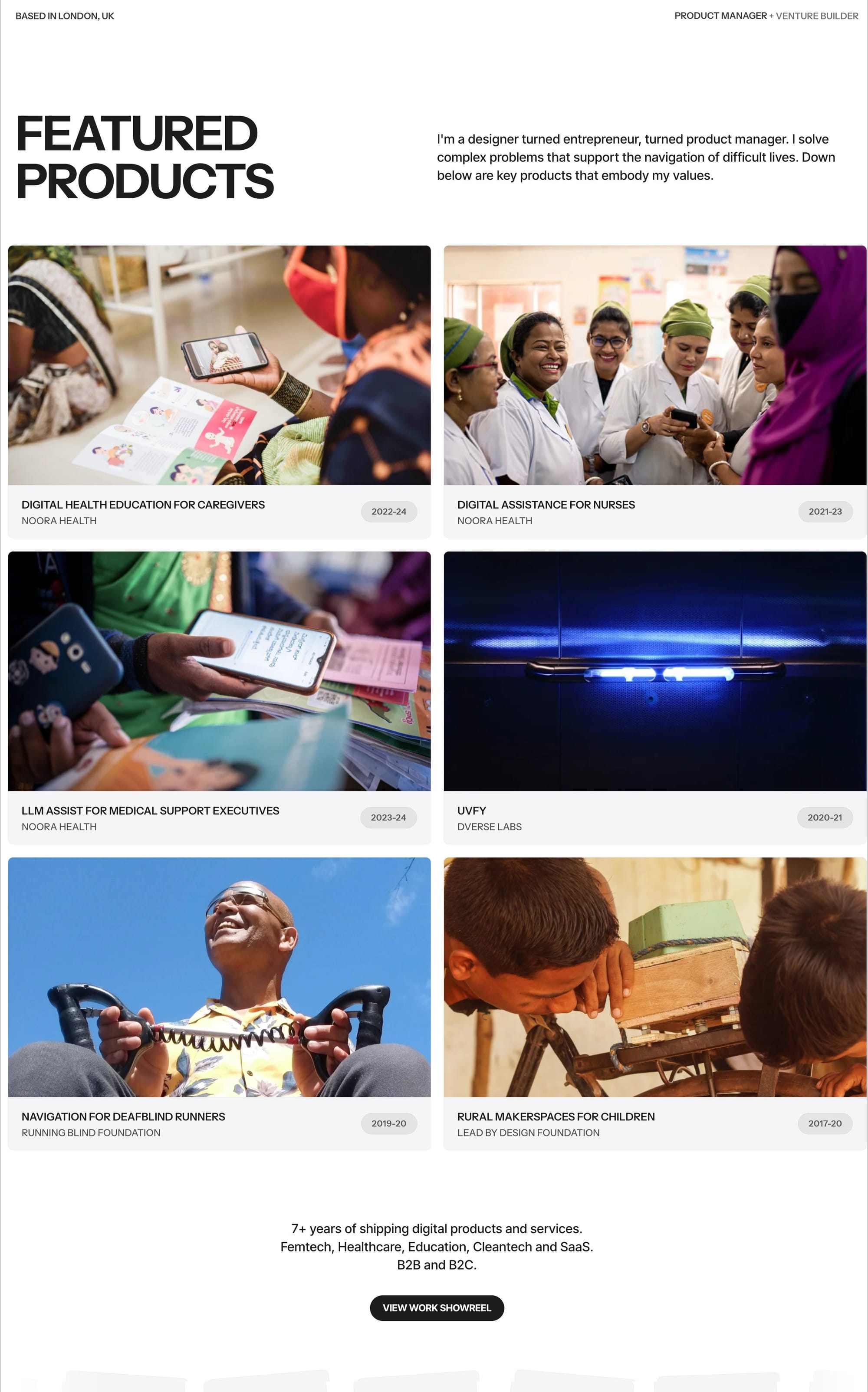
How might we enable patients to overcome preventable medical conditions?
A peek into the building of Remote Engagement Service (Bangladesh), a digital health education and support service
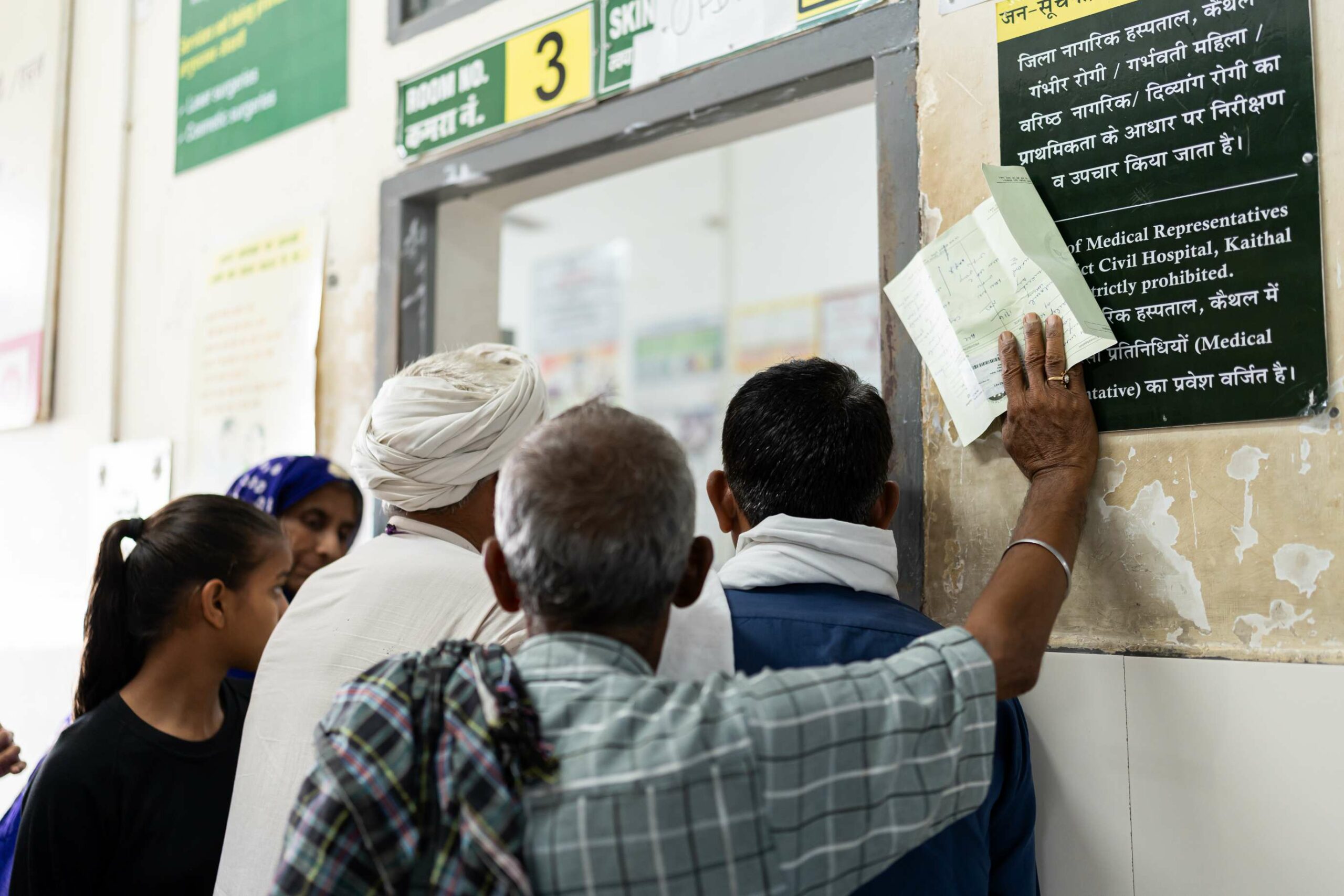
Imagine being a young mother-to-be, living in a remote village in Bangladesh, eagerly awaiting the birth of your child. You make the long journey to the nearest hospital for a routine check-up, filled with excitement. But as you leave, a sense of uncertainty weighs heavy – how can you ensure you'll have the knowledge and support to care for your newborn properly?
For millions of marginalised patients and caregivers across Bangladesh, this is a harsh reality. Overstretched public health systems mean many leave healthcare facilities unprepared, risking preventable complications due to a lack of essential care knowledge.
But what if a simple technological solution could bridge that gap? A digital lifeline providing vital health education and support directly to those who need it most?
Over the past 30 months, my team has poured our heart, soul, and countless hours into developing just that – a Remote Engagement Service (RES) using accessible channels like WhatsApp and voice calls. And the impact has been lifesaving.
In this essay, I'll take you on the journey of Rabeya, that young expectant mother, and share the insights gained from our efforts with RES Bangladesh—
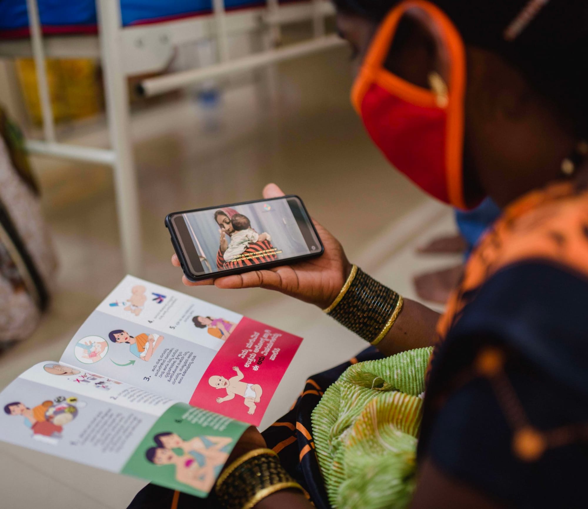
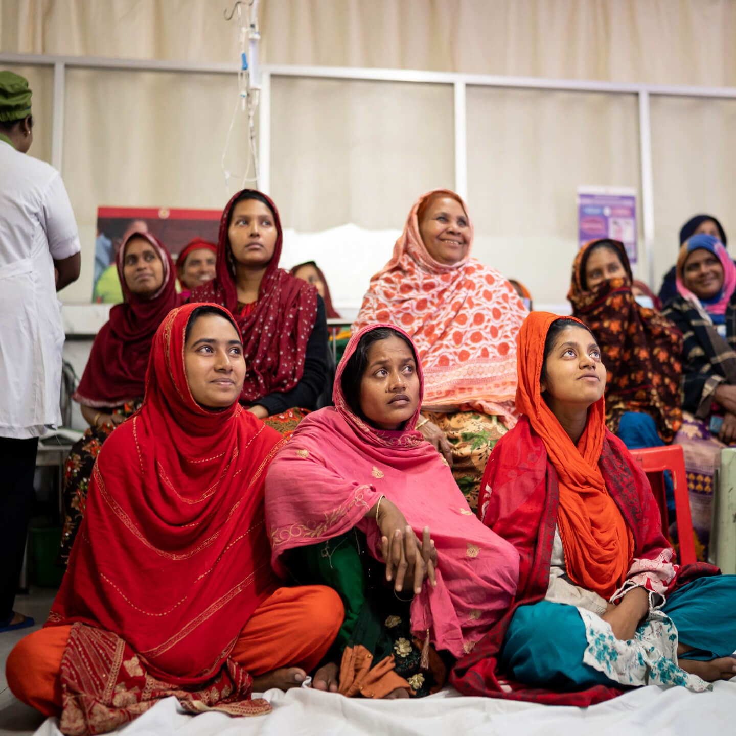
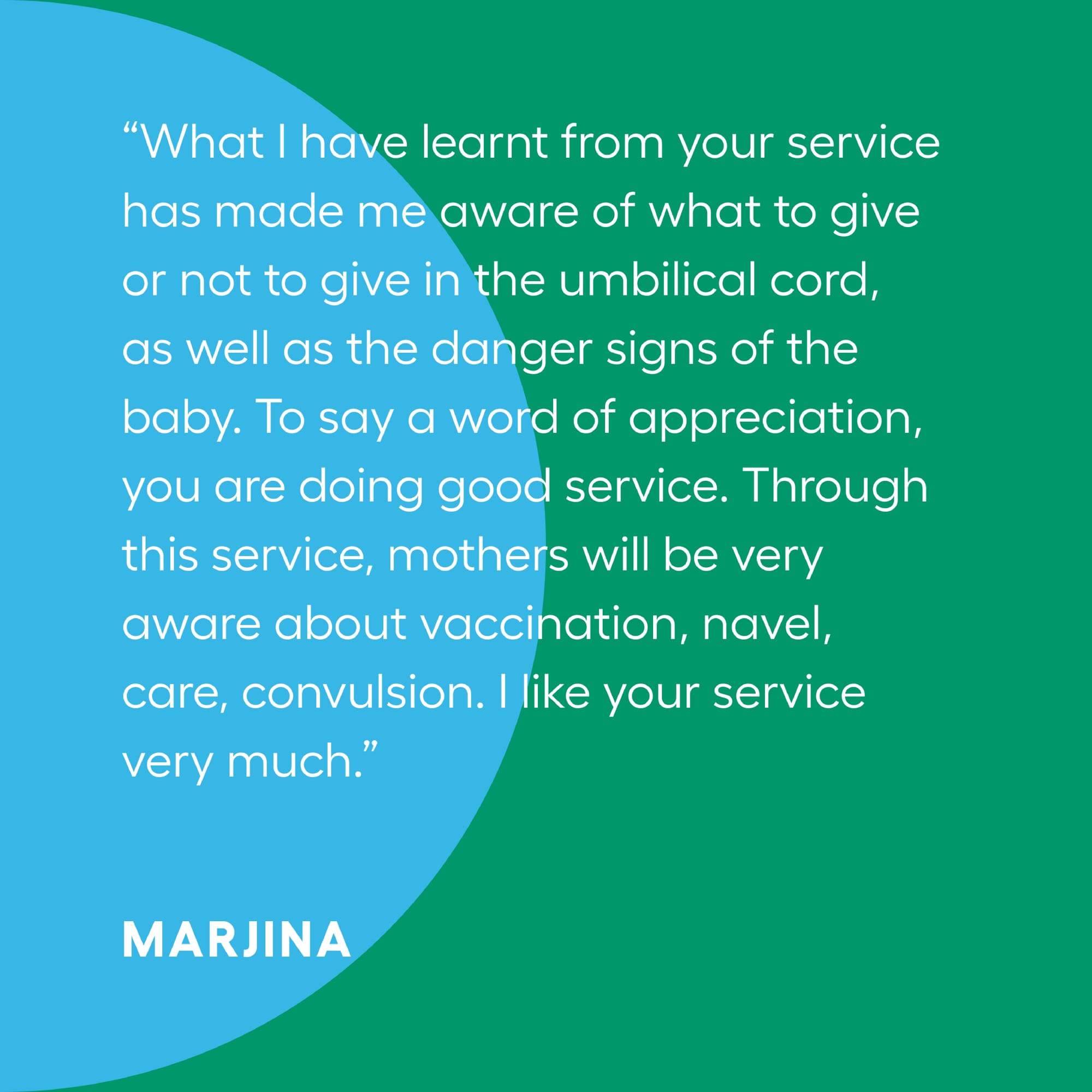
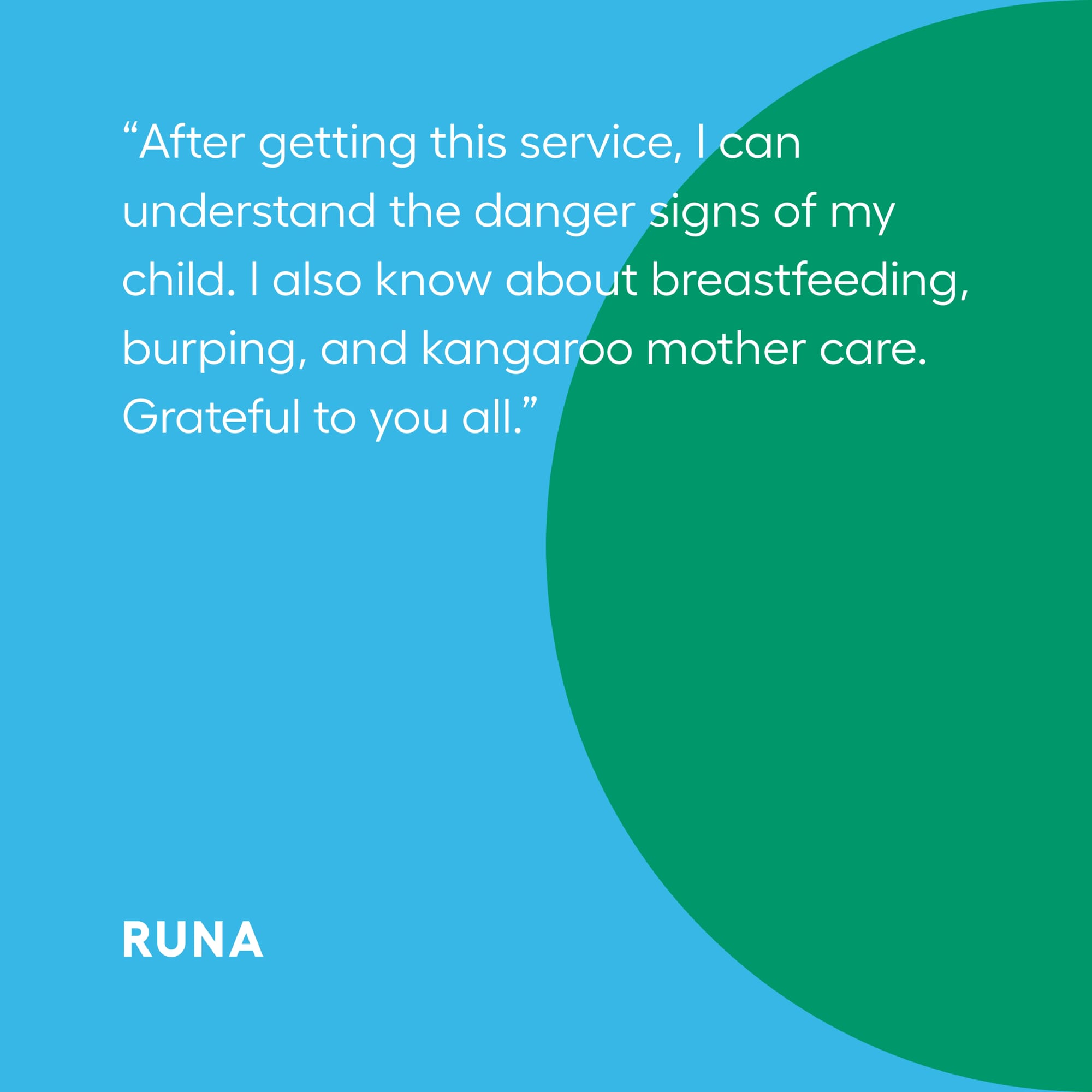
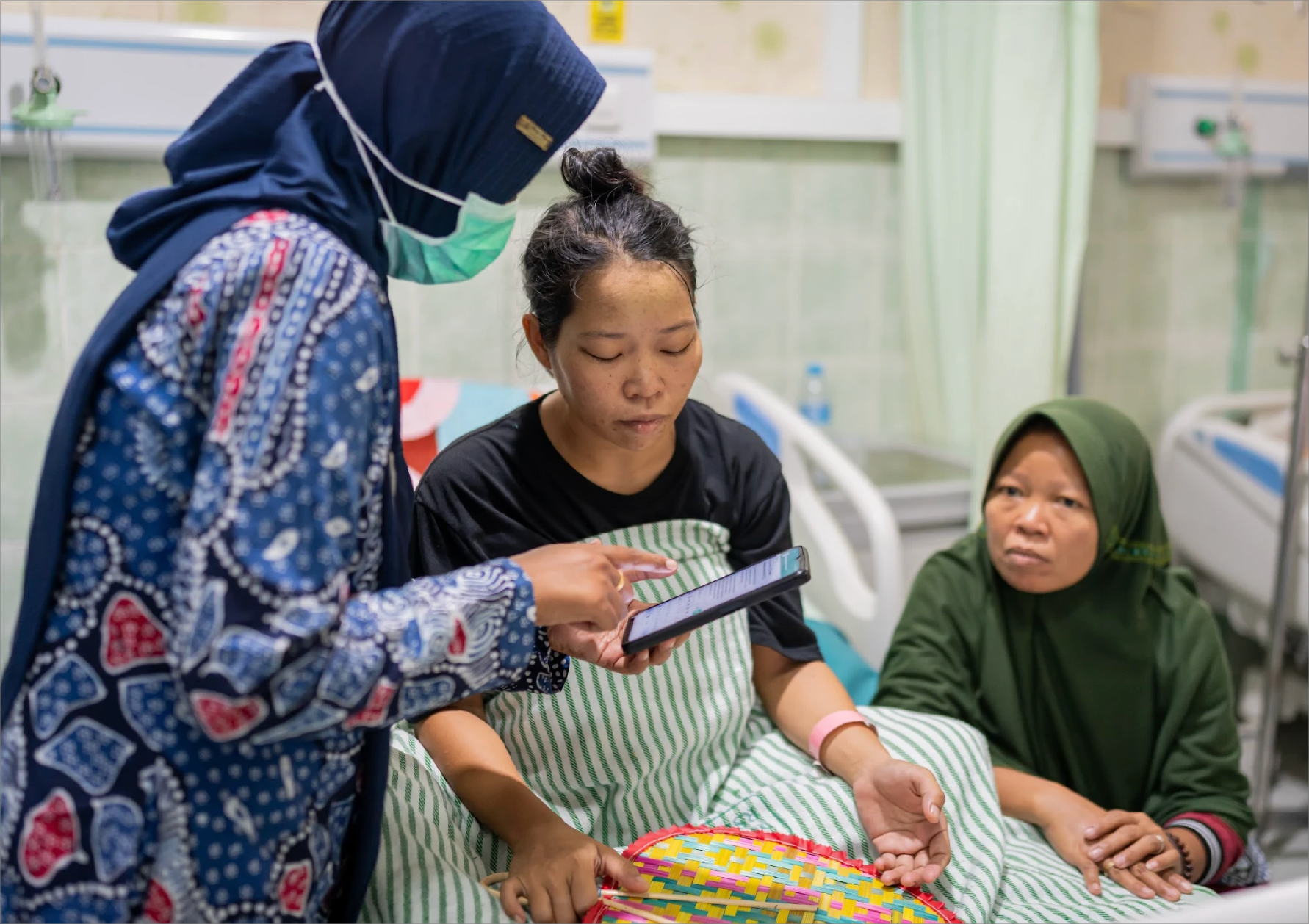
While Rabeya eagerly waits for the doctor's appointment, she participates in the Care Companion Program, a health education service conducted by the nurses. Through simple language, the nurses provide guidance about the importance of nutrition, routine check-ups and self-care.
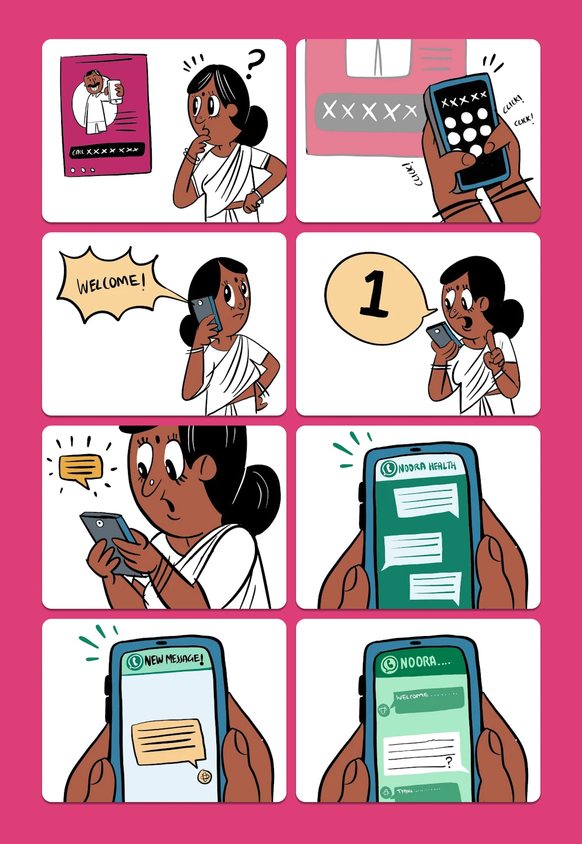
At the end of the hospital session, the nurse encourages Rabeya to subscribe to RES either through a QR code, or by directly calling the phone number.

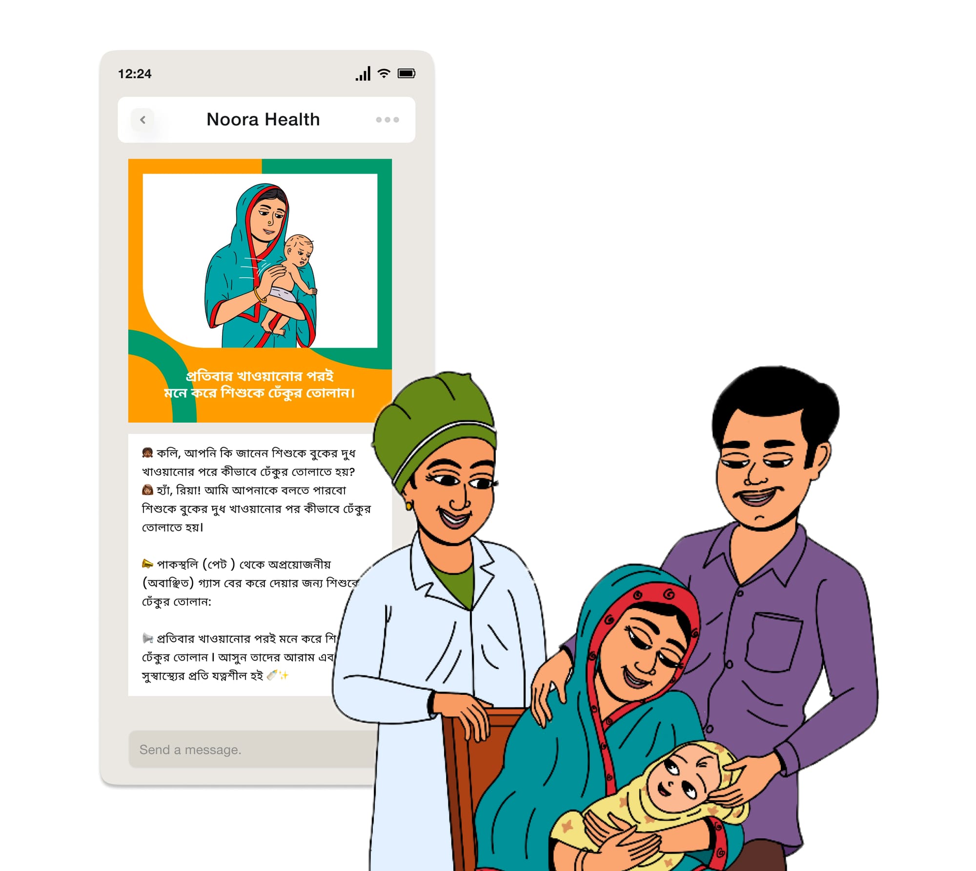
Rabeya is onboarded to the service through a simple three-step process. She selects the campaign for expectant mothers, as well as her preferred medium (in this case, she chooses Whatsapp over a voice call service).

Once onboarded, she is gently nudged to enter her expected due date on Whatsapp. The RES service gets personalised based on this crucial timing.
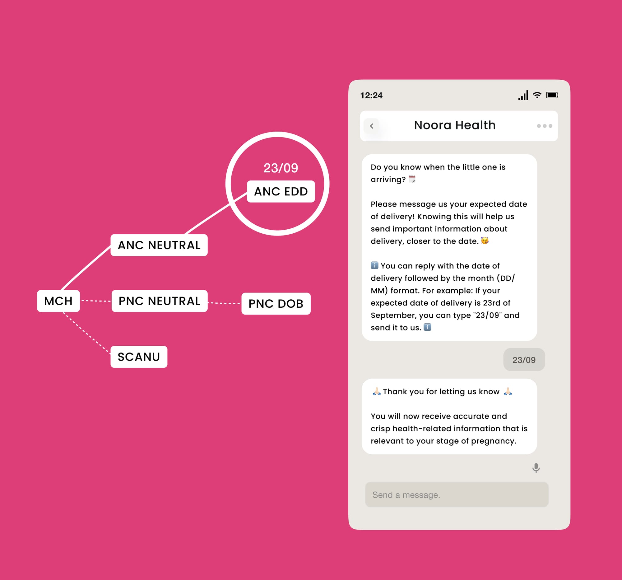

As an expectant mother, Rabeya is guided towards doing her regular pregnancy checkups from nearby facilities. She is also reminded to take her iron and folic acid tablets on time.
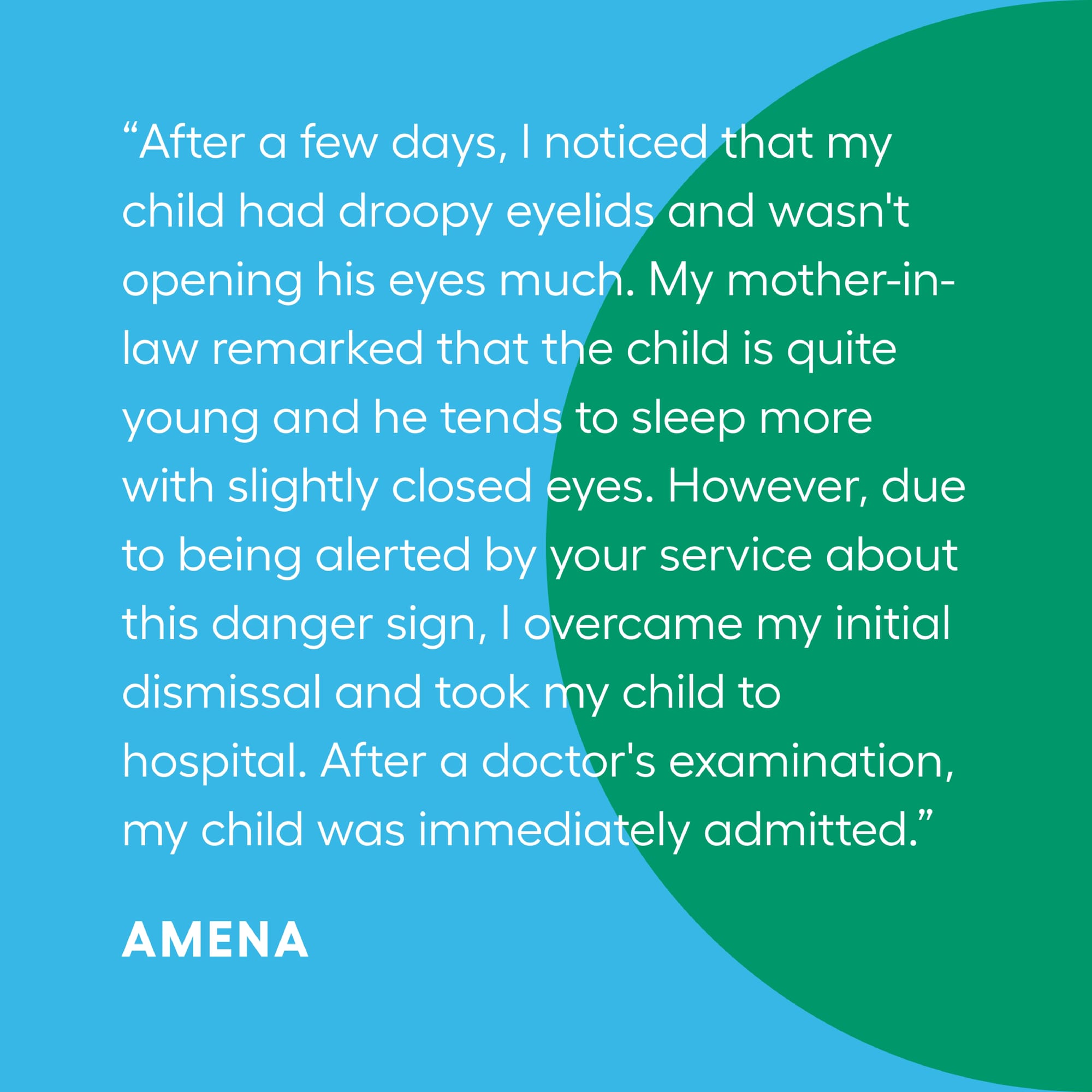
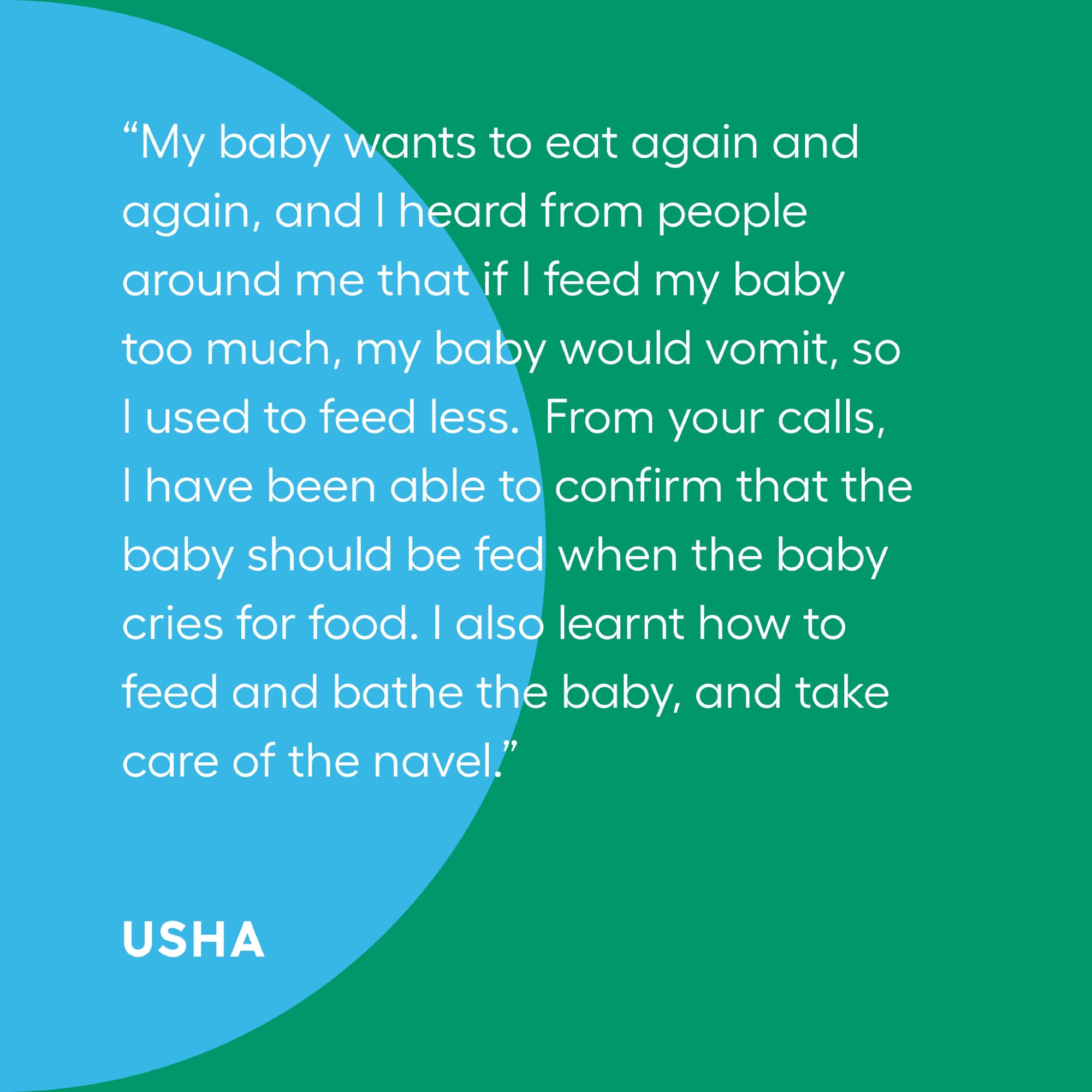
As she starts learning about various key topics, she starts asking questions surrounding her pregnancy. One day, she notices some signs in her body and remembers to seek help from the service.
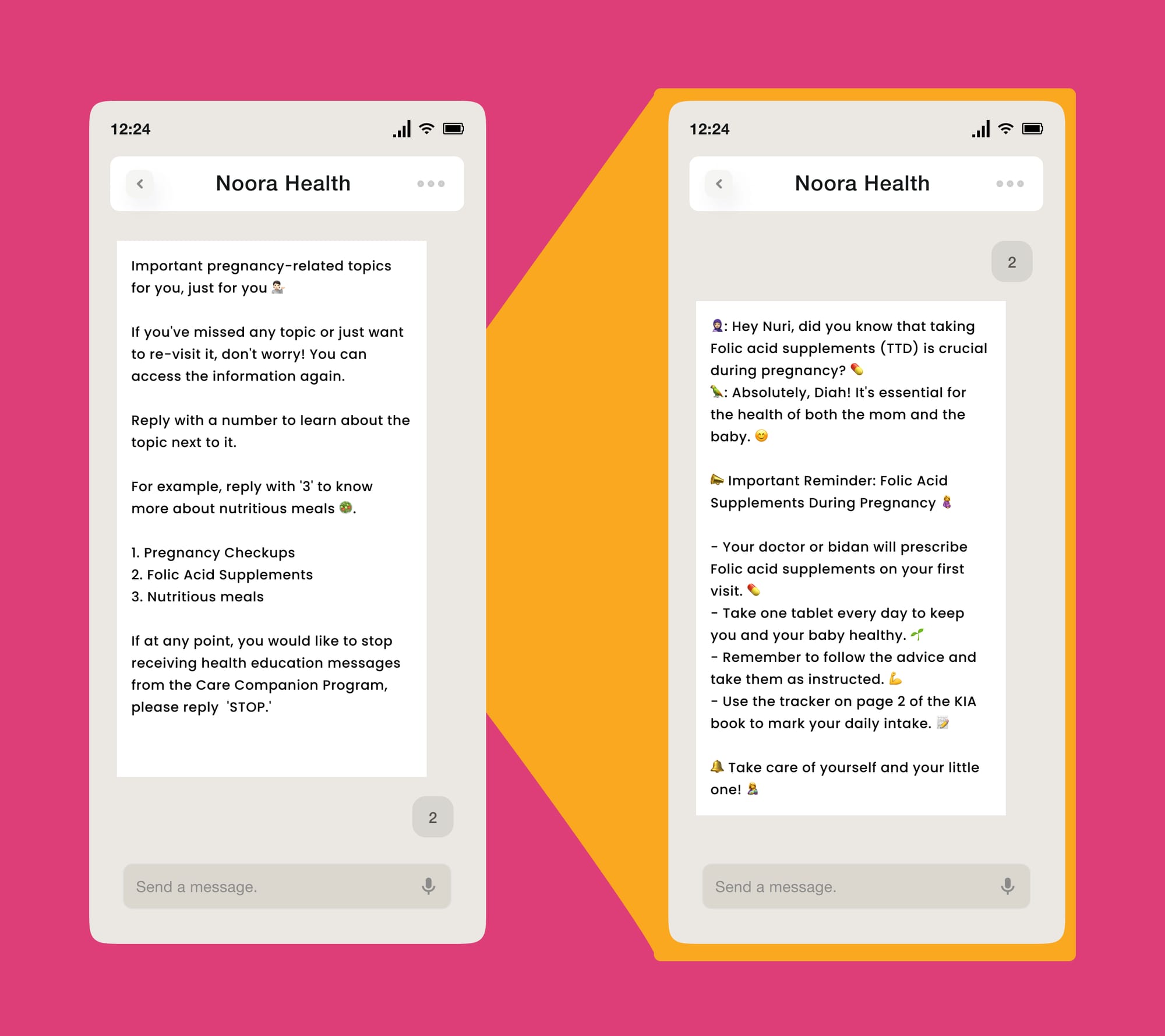
In this way, she receives health support from clinical experts such as nurses and doctor as and when needed from the comfort of her home.

Rich media is used liberally to reinforce key health topics and to aid in retention
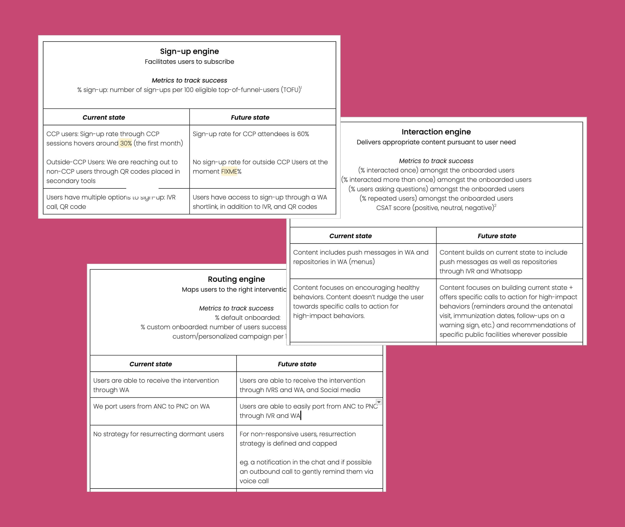
As shown from the journey of Rabeya, these are the core features of RES:
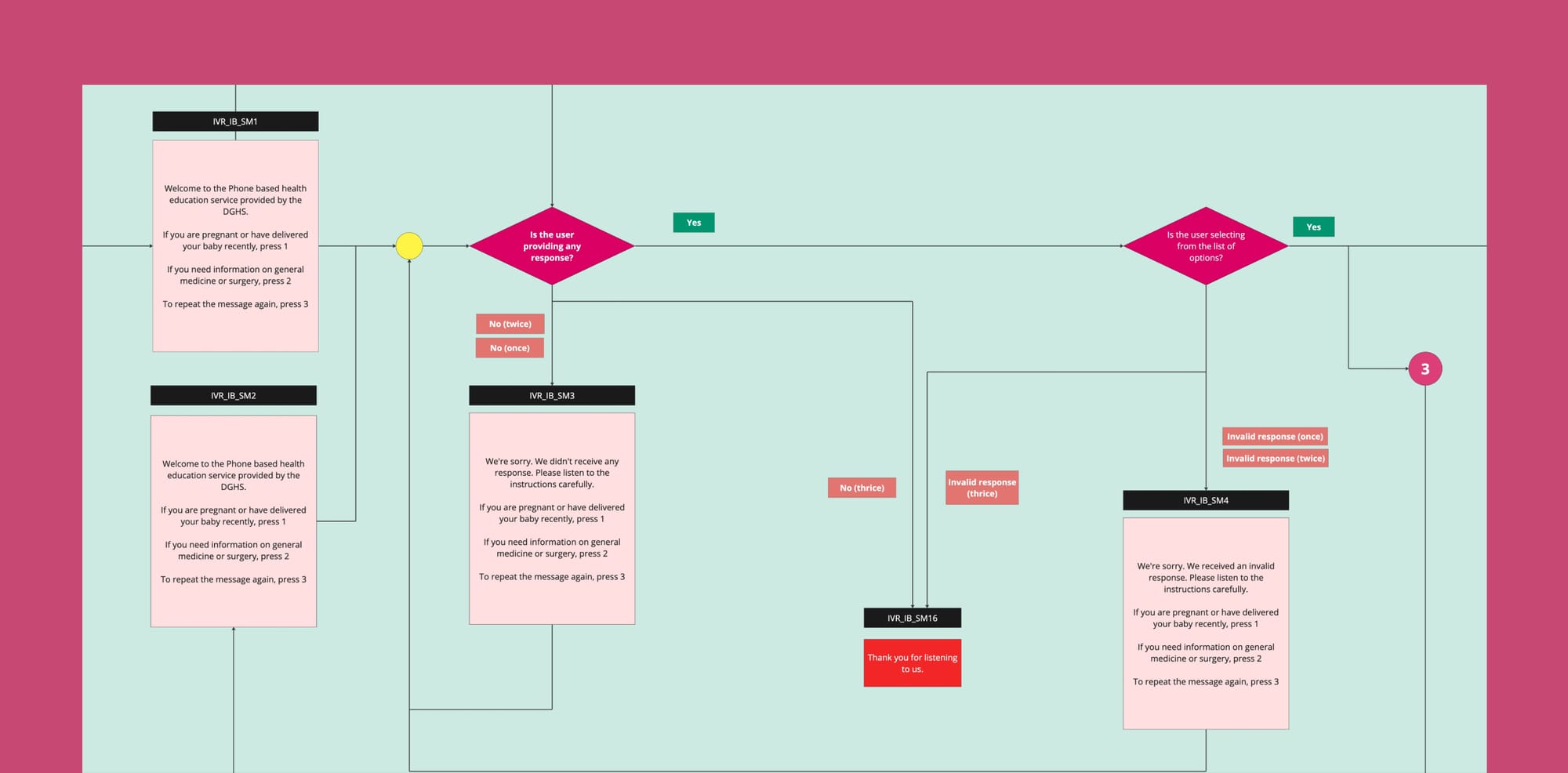
- Availability across multiple modalities: WA (scheduled messages, chatbot, and live chat), Voice (IVRS), Teletraining (live calls)
- Availability across multiple condition areas: MCH (Maternal and Child Health), NCD (Non Communicable Diseases), Cardiovascular, TB (Tuberculosis), General Surgery/Medicine
- Human-in-the-loop AI health responses: Only medical experts provide health responses. By leveraging LLMs, responses are served in a reliable, accurate and efficient manner
- Provides Behavior Change Communications: Both instructional and narrative styles of content, rich media (images, gifs, short-videos)
- Customized to stage and severity of need
Journey behind building RES
I’ll go one level deeper into the process followed—
Phases
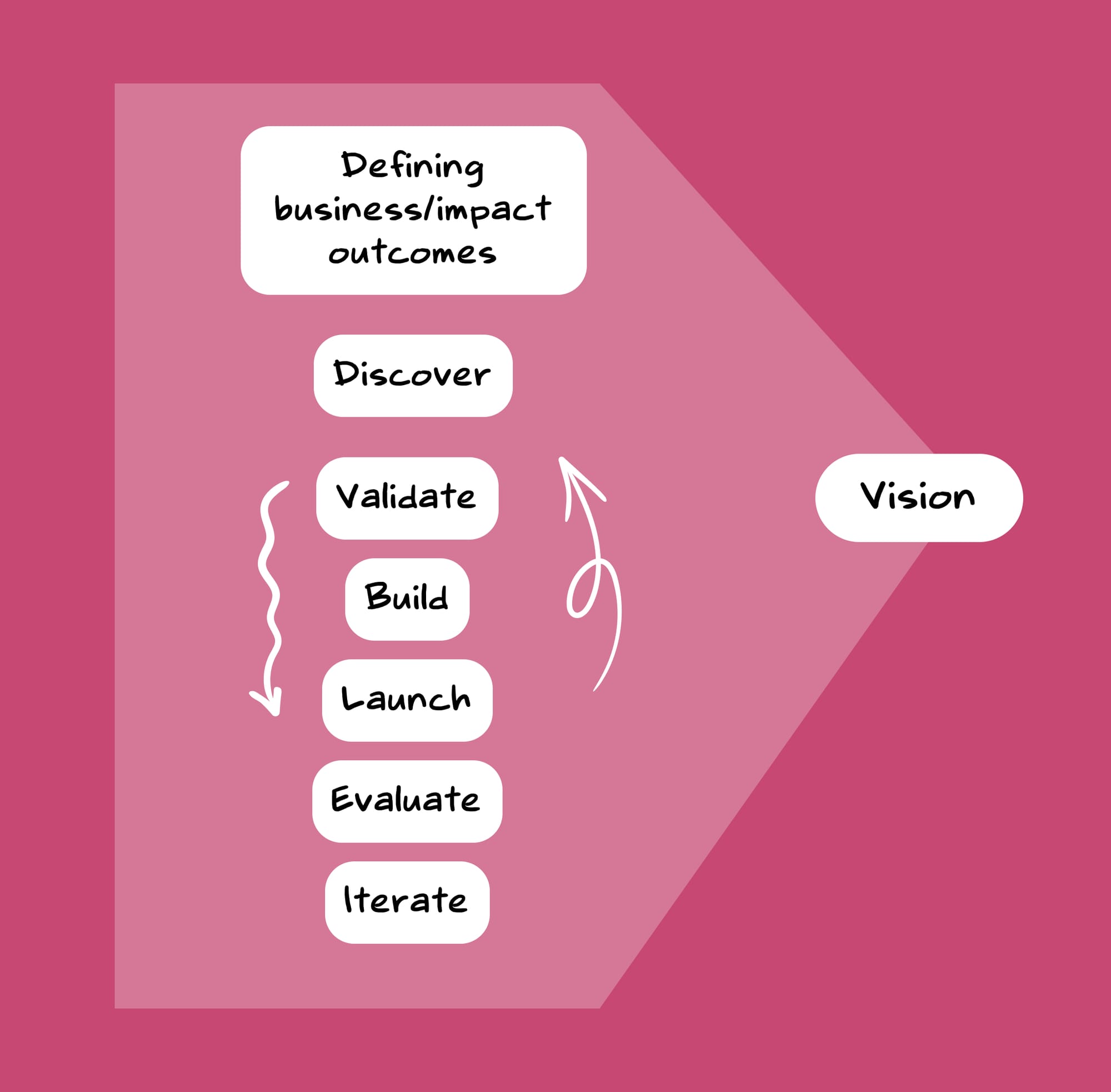
One—Defining Business/Impact Outcomes
The phases such as Defining Business Outcomes, Discovery, Validation, Building, and Launching might seem like disparate blocks, but they were all tied together by the vision. This vision serves as the connecting tissue, helping move the pieces together seamlessly, like a well-oiled engine without any jitters.
As a Business-to-Government-to-Consumer (B2G2C) model, we aimed to support Bangladesh government's health initiatives were focused on reducing the maternal mortality rate (MMR) and infant mortality rate (IMR). Bangladesh had roughly ~157 maternal deaths per 100,000 live births. To provide a benchmark, the Netherlands has ~4 maternal deaths per 100,000 live births. Noora Health's pitch to the government was to establish family caregiving as a standard of care, thereby reducing the MMR and IMR rates through the intervention.
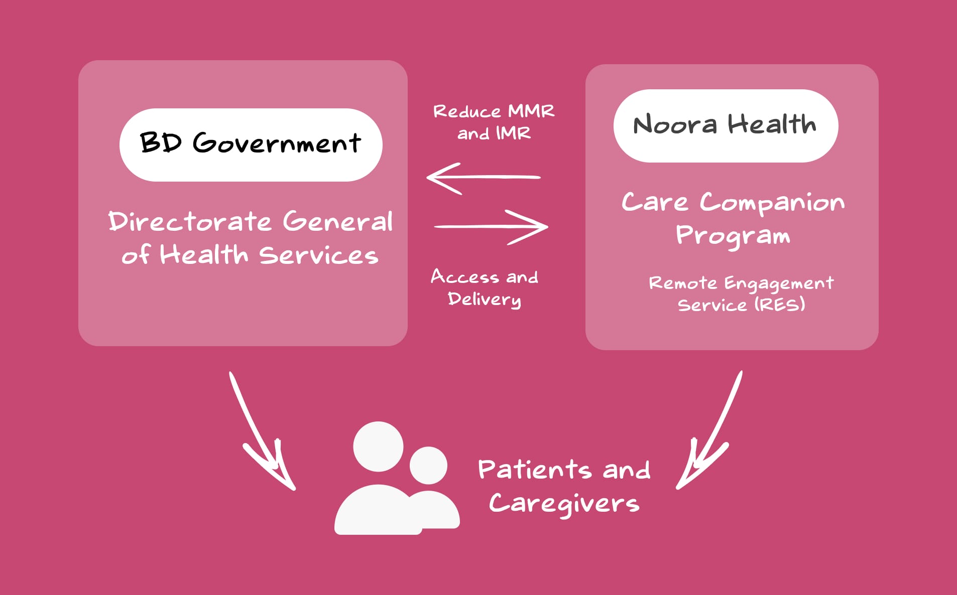
We got into our first MoU with the BD Health Ministry to pilot, gain evidence, and to integrate the program into the public health systems. That’s how we started our operation.
My initial efforts during this phase was to make RES simple and easy to remember. To reduce the complexity in the communication, and to revive and evangelise interest towards RES, I showed a vision for RES BD—Every user overcomes any preventable medical condition digitally. Nurses were also trained to communicate RES in a simplified manner as—'Health education for you and your baby'.
To make the direction of the vision even clearer, I worked closely with the Head of Product to break down the complex roadmap of RES into a simpler, more digestible format for all team members.
Discovery Phase
Recognising that a direct replication of our previous strategies in India wouldn't suffice, we approached the situation with a fresh perspective.
My team and I explored the patient health journey across district hospitals, sub-district hospitals, and primary care centers in Bangladesh. This exploration aimed to map out how patients were accessing healthcare systems.
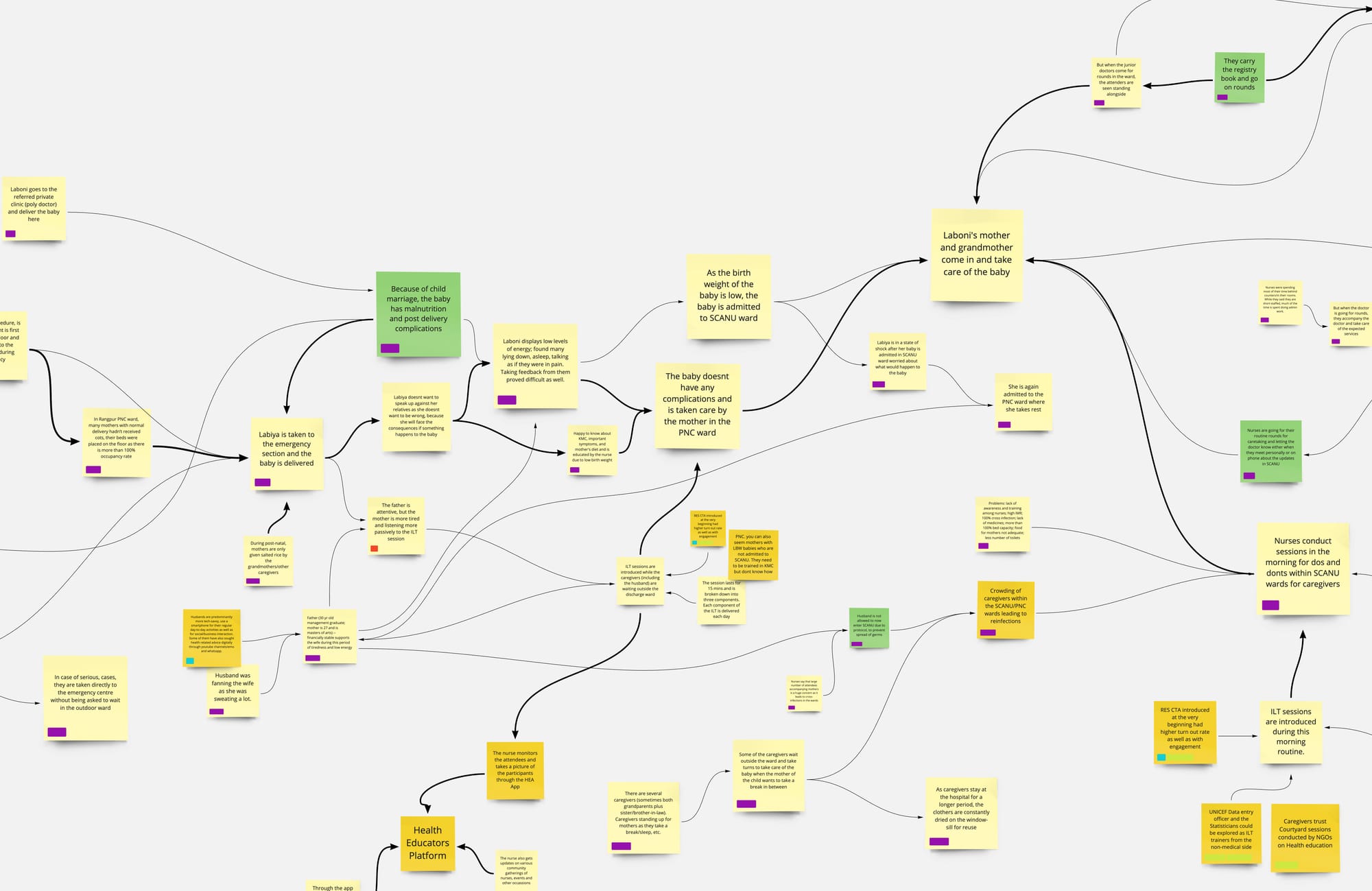
We were not optimising for a single user journey; rather, we addressed multiple journeys across various segments and touchpoints. Consider Rabeya's path—her experience extended far beyond that initial visit to the sub-district hospital.
Rabeya might attend her antenatal checkups at the local health complex, received home visits from community health workers, and may have even been referred to a higher-level facility for certain procedures or complications.
Each touchpoint represented a crucial opportunity to educate, empower and provide continuous support tailored to her evolving needs.
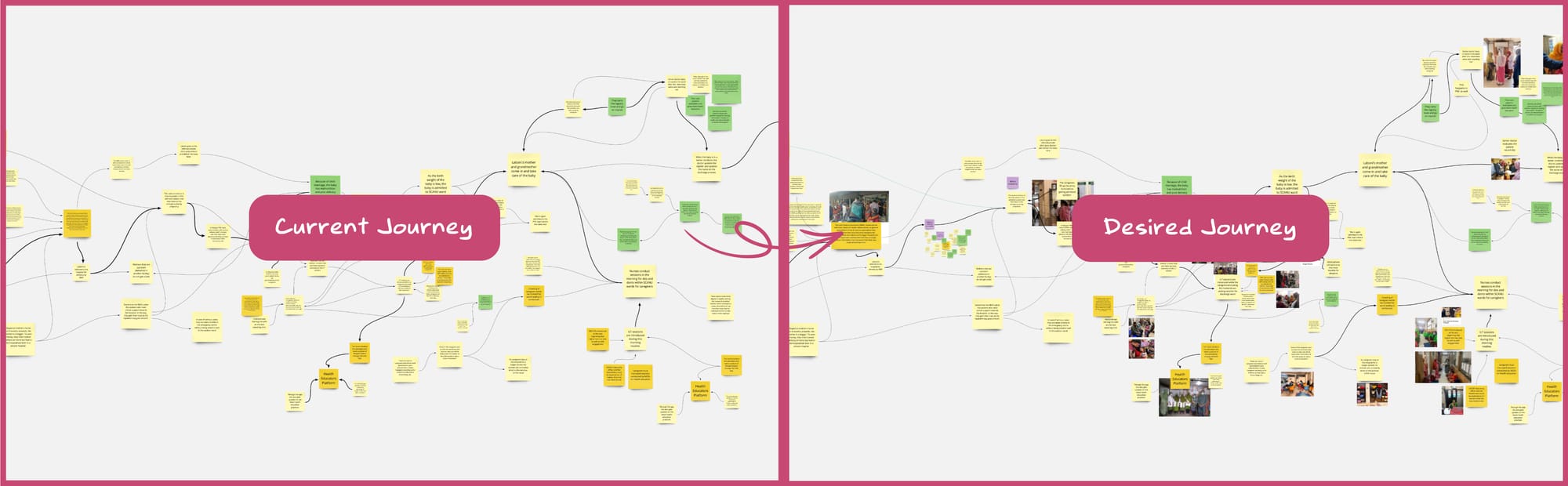
This synthesis (through affinity maps) informed the initial draft of our product requirements document, ensuring it was grounded in the diverse findings from our field and desk research. This helped us to imagine the desired journey in contrast to the current journey.

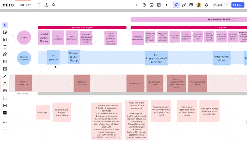
Another framework which proved to be quite useful in digesting the complexity of the multi-touchpoint user journey was the service blueprint.
Some key directions from our discovery phase:
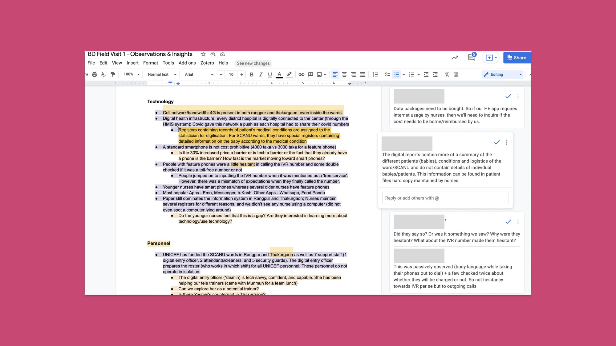
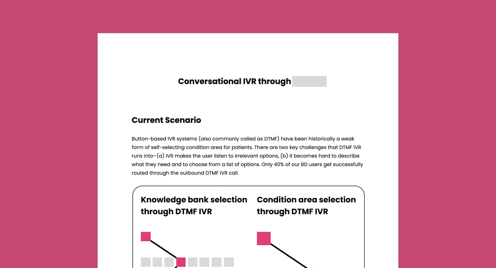
Voice calls as a primary medium—During our discovery phase, we analyzed the overall usage of smartphones among the rural populations in Bangladesh. As of last year, 41% of mobile phone users in the country had smartphones. With low WhatsApp penetration and internet usage being distributed among various platforms like Facebook and Emo, Interactive Voice Response (IVR) was chosen as the primary medium for our RES service. This decision was supported by our field observations and corroborated by reports, which indicated that often only one smartphone is available per family in rural areas (The Business Standard) (GSMA).
Timing our service around date of discharge—We designed our RES service to start immediately after a high-risk baby is discharged from the hospital, typically after 7-9 days. This timing aligns with one of our core design principles: to provide the right information at the right time. We adopted a similar strategy of timing our service while designing for diabetes patients, surgical care, newly delivered mothers etc.
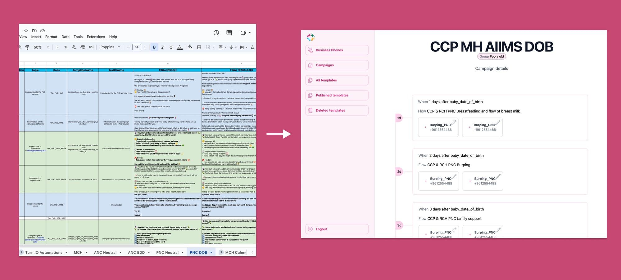
Contextualisation and personalisation of the messages—RES campaigns were made more personalised to the geography they served. We adopted a more conversational format mixing curative, and promotive themes for behaviour change. We went on to also hire country specific teams across the Health Communications, Medical Strategy as well as Media/Film to ensure the content was adapted to the context.
All these guidelines and features were depicted in the product requirements doc that served as a means of garnering consensus, providing clarity to the respective engineering and design teams.
Validation Phase
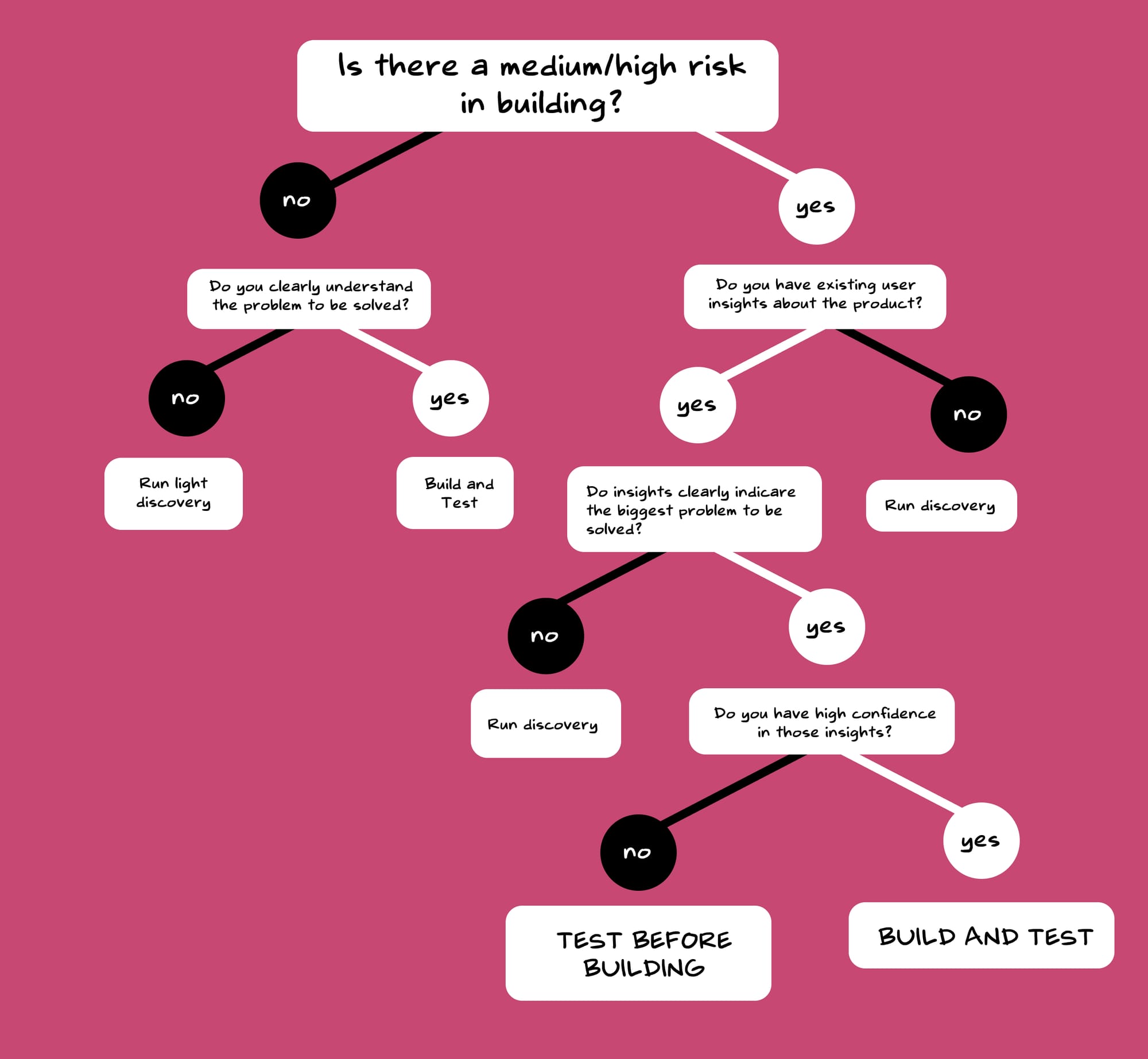
Should we build and then test? Or should we test and then build?
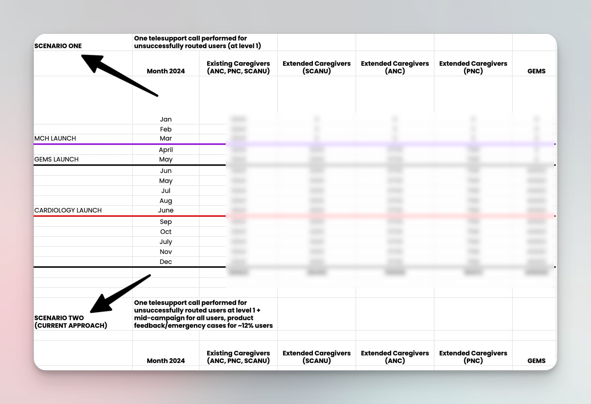
When facing this dilemma of whether to—build and then test a product or to test and then build, our approach varied based on the situation. As we always dealt with the trifecta of scope, time and effort, we needed a more structured approach to deal with these decisions. For more 'risky' features, we designed a lightweight pilot version first to test the concept in a controlled, manageable way. However, if the associated risks were minimal, we chose to launch first and then validate the feasibility afterwards as shown below—

Build/Launch Phase
Our product development process blended elements of both waterfall and agile methodologies, particularly crucial in the healthcare sector where careful planning of user-facing releases is imperative.
We methodically rolled out features over a 2.5-year timeline, carefully managing the evolution and growth of the service. The roadmap for what needed to be built was articulated in a detailed service map (as shown below), which facilitated collaborative feedback from all stakeholders. This ensured smooth transitions during technical handoffs, reducing risks and enhancing the effectiveness of our launches.
Evaluate Phase
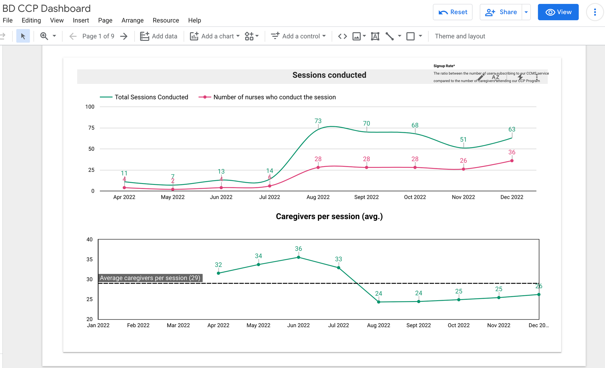
Before we evaluated, we didn't have proper systems to evaluate. When we started, we lacked a centralised product dashboard integrating data from various sources.
Setting up systems for data-led evaluations
To support the tech team, I created early prototypes of the dashboard to demonstrate our requirements to the tech team. The visual prototypes proved to be useful for kickstarting conversations around the dashboard and gaining momentum to push it forward.
After diagnosing, and identifying the gaps, the data engineering team established pipelines, warehouses and the dashboard for helping us take data-driven decisions.
Setting up systems for user-led feedback loops
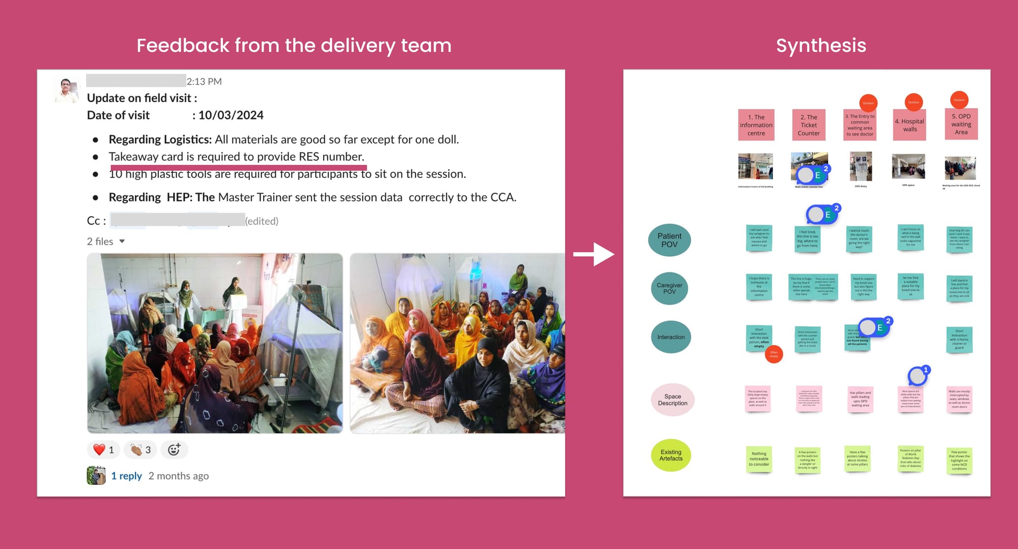
To collect more insights from the field and from our users themselves using our service, we established a regular schedule of field visits for the RES team to engage directly with patients and caregivers. This allowed us to continuously gather and analyse data from various channels to better understand their needs.
Key initiatives that I spearheaded to deepen our user-feedback loops included:
Mid-campaign support calls—These calls not only built trust with caregivers but also served as vital two-way communication channels. For instance, we discovered that 96% of our Whatsapp users read our messages, but struggled with literacy, impacting their understanding of the health-related content.
End-campaign surveys and feedback—Responses to our messages and updates from the delivery and implementation teams were crucial in synthesizing insights. On one occasion, we learned that users were sharing the RES contact number using takeaway cards among family members. This observation prompted us to redesign these cards to facilitate easier dissemination among patients and caregivers.
Taking effective decisions—A good decision was a mix of taste, data and insights. After having set up systems to process data, systems for gaining user feedback, it became relatively easier to take crucial decisions. Taking both data and insights into the decision making process was quite crucial. In some cases, we had contradictory user viewpoints. Or in other cases, the data was quite contradictory to the user narrative.
What people say, is different from what people do, is different from what people think.
Example decision—Deciding between voice calls and Whatsapp
Example decision—Evaluating telesupport capacity
Iterate Phase
One of my core philosophies in product development is to view each product as a work in progress that is never truly complete. This perspective reinforces the necessity for continuous improvement, as a product is never 'done'. In managing our development cycles, I advocate for a 70% focus on enhancing existing features (exploit) and 30% on exploring new possibilities (explore). This approach ensures that while we continuously refine our product, we also remain vigilant to emerging cultural, regulatory, economic, and technological trends. Exploration is conducted through a '5C lens'—Customers, Collaborators, Competitors, Climate, and Company—to identify and integrate new opportunities into our opportunity hypothesis.
For instance, we observed a growing trend in the use of large language models (LLMs) to deliver health-related information quickly and effectively. Inspired by this development, we integrated LLMs into RES, primarily to enhance health intent recognition and support clinicians in providing faster, more accurate responses.
In the exploitation phase—we focused on refining our core product—we devoted considerable efforts to structuring our response system more efficiently. This involved creating knowledge banks to prevent repetitive responses and formalising protocols through standard operating procedures.
Incorporating Feedback—Aligning stakeholders along the whole process was the most challenging part of this process. To solicit timely and relevant input from stakeholders, it was crucial to present them with the appropriate artefacts at the right level of fidelity. Overly detailed artefacts might deter critical feedback, while overly vague ones might not provide enough substance for meaningful commentary. We used one pagers, concept notes, mockups, and sometimes even service prototypes to gather feedback
Beyond simple concept notes, we often found it more effective to simulate the entire user journey through a walkthrough. This approach transformed the experience into an interactive role-play rather than just a static document, making the feedback process more engaging and insightful.
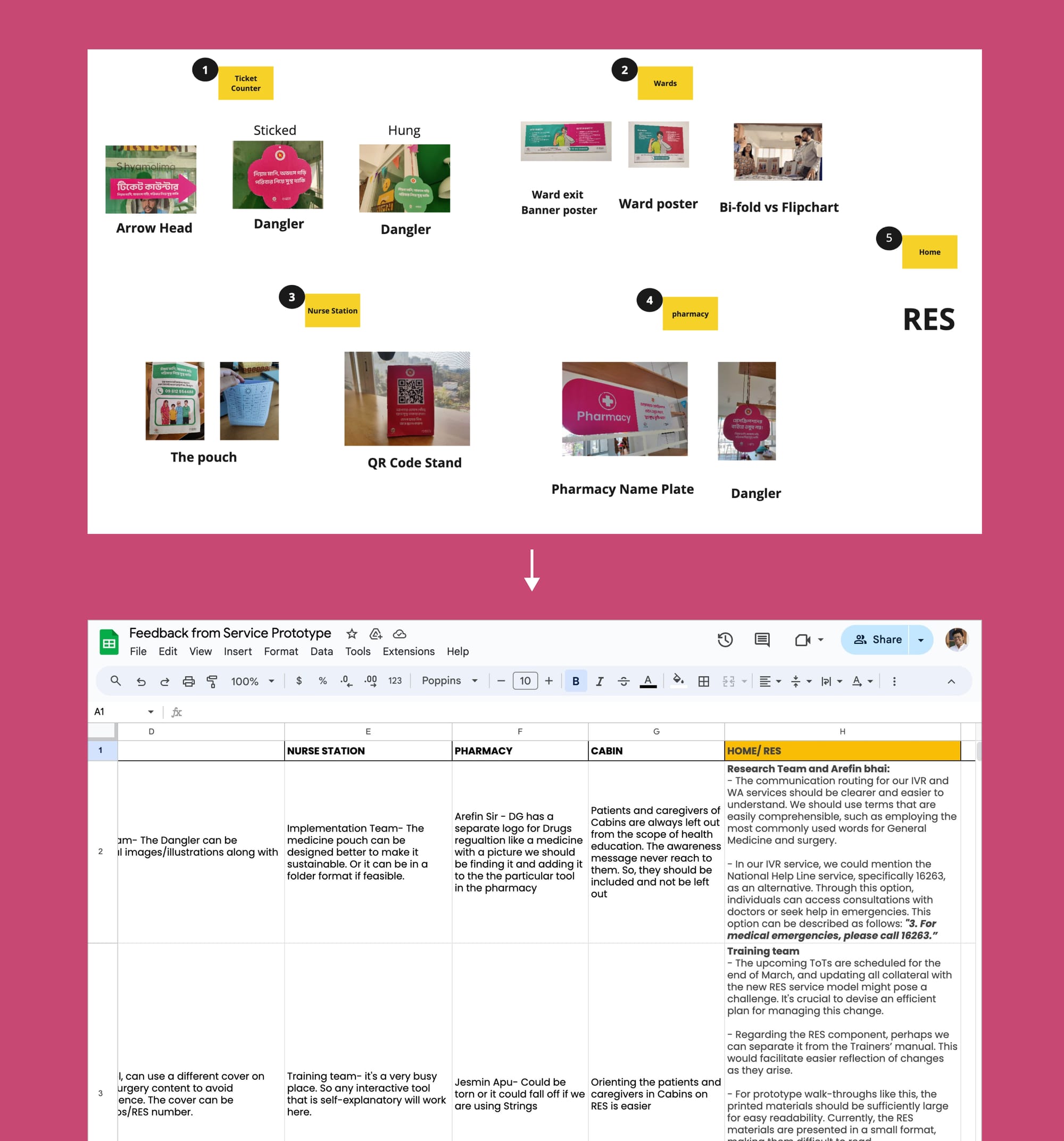
One Pagers — Sometimes showing a prototype might feel like too much effort was put into its production that some stakeholders might avoid providing harsher feedback. They might feel that it's already well formed, and any critical comments would probably not be incorporated. To avoid this barrier, concept notes/one-pagers come in handy.
Medium Fidelity Prototypes — When I usually build the case around the opportunity, and have to start from zero, momentum is gained with a medium-fidelity prototype. By putting an idea out there, even if it's totally wrong is much better catalyst for getting to a good solution as people are more likely to react to an idea than to nothing. Prototypes were a great source of enquiry. Prototyping was also my super-power and used my personal conviction to fuel the development of such prototypes.
Imagine Rabeya's relief at receiving bite-sized WhatsApp lessons perfectly tailored to her needs as a new parent. Or the reassurance of having a supportive voice just a call away, ready to guide her through those inevitable anxious moments. For her, RES Bangladesh became a trustworthy companion on one of life's most profound journeys.
But the true measure of our success lies not in metrics, but in the countless lives touched.
In parents empowered with knowledge.
In preventable complications avoided.
In the smiles of healthy children born into a brighter future.
I’ve been obsessed with my personal website. It’s not even about the views and impressions which I’m receiving. I have one subscriber on my mailing list from my website, and compared to internet writer standards, I am virtually non-existent.
Yet, I care deeply about this little corner on the internet. It's a place where I optimise for depth over engagement and audience-building.
It’s my resume, my business card, my store, my directory, as well as my own personal magazine. It’s that one place online that I completely own and control.
As David Perell puts it, it's one's own intellectual real estate.
I’m obsessed with it enough to keep revamping my website every year. Just like the corporate re-branding exercises we’re familiar with, I do my own rebranding for my personal website. I reflect on what is NOW my personal brand. I sometimes redo the styling, the fonts and the formatting from scratch and start with a clean slate. I sometimes redo my writing based on my current thinking style and philosophy.
Previously, my favourite font of choice was Karla, then I switched to Poppins, Assistant, Inter, Helvetica Neue and now I'm falling in love with antique serif types (such as the one you see here in this blog)
Every time, I looked back at my previous work as depicted in my website, it felt shitty, and poorly done. But that was the whole point. The new version of yourself would never be satisfied with the previous work you've put in. I think @reidhoffman’s “If you're not embarrassed by the first version of your product, you've launched too late” applies well here.
I now had newer updated standards. My personal website updates have mapped my personal evolution over time, as well as my current standards of quality work.
My first website was a Tumblr blog containing a roll of all my photos under one roof. Back then, I identified myself as a photographer, and wanted to showcase this skillset to the world. Slowly, with more and more experiences, the labels which I used to define myself changed. Four years back, I was labeling myself as a ‘UI/UX designer’, and tried to showcase my love of design through my portfolio site on Wix. The objective of this site was to help in job conversions. I wanted recruiters to look at my website and ask for an interview. My way of achieving this was to put mountains and mountains of work online, and in public.
Whenever there was a reference to my previous work, I mapped the portfolio project links to keyboard shortcuts to make it easier to share with the headhunters on chat windows. And whenever I got an opportunity, I shared my screen, and took them through my work reel. I’d obsessively documented my work and my projects. And I was proud of it all.
A sure shot way to demonstrate my competence and core skills. Share widely, engage with peers. Debate/collaborate with folks who approach me through my website. Leave behind a legacy online.
And I waited for job offers to roll in. And it did!
My current role as a Product Manager at Noora Health was a result of this building-with-my-garage-door-open-stint.
I had my skin-in-the-game as well as my soul-in-the-game.
This year, I wanted to revamp my personal website with a focus on writing. I’ve been lately viewing writing as a form of thinking, and I wanted to condense and crystallize my ideas into one roof. I redesigned my website again with this brief in mind.
This was a setup I was satisfied until I realised how all those javascript animations and micro-interactions were killing the load time and performance of the website. It was at this junction that I discovered this site.
I wanted to make my site more 'simple'. So, I dumped the earlier direction of a '13 megabyte parallax-ative home page prepping for some awwward banner on the top corner of my site'. I just used simple HTML5 tags, deleted all the complex JS and checked the performance speed again.
My current website reflects a lot of my ideals here. I dumped my original plan of making it more 'designerly', and went for simplicity instead. Simplicity is the ultimate sophistication.
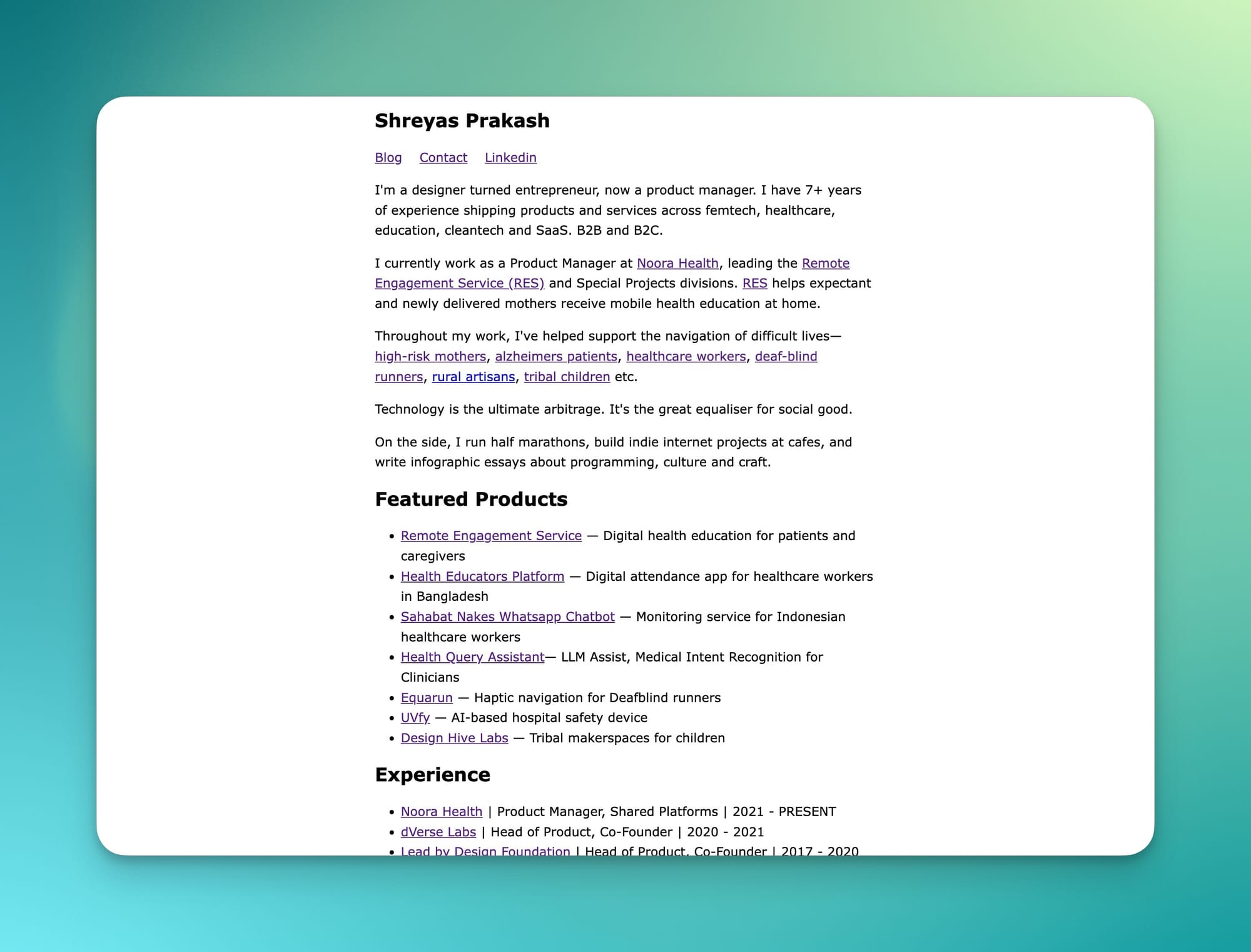
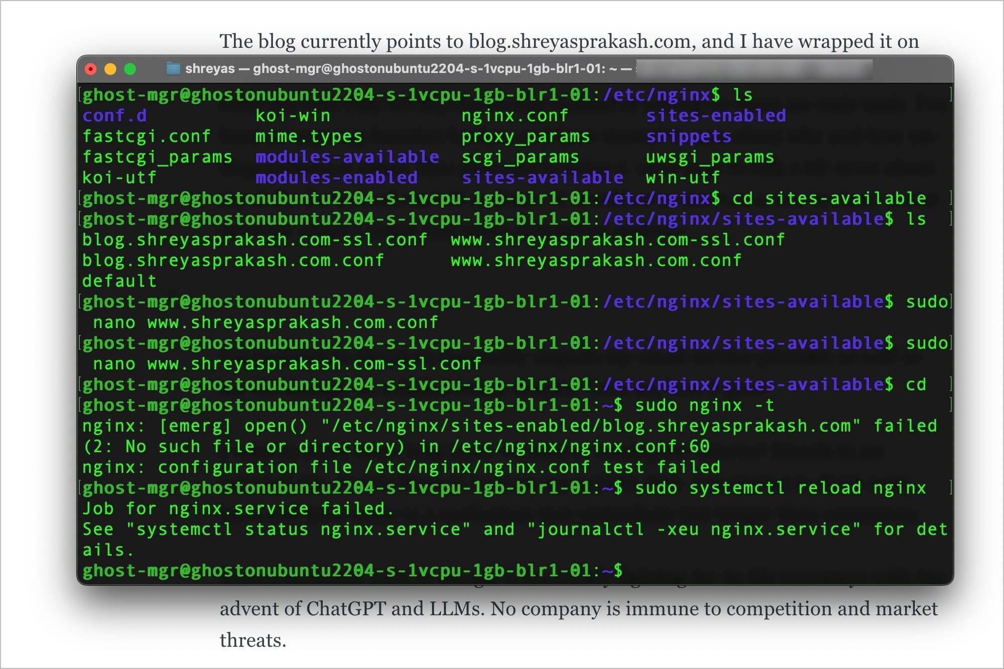
Simple not just on the front-end, but on the back-end too. The front end blog is hosted on Ghost, an open-source platform for publishing blogs. The blog currently points to blog.shreyasprakash.com, and I have wrapped it on my personal domain as an external wrapper. I’ve been an aspiring founder/hacker, and have started to care about why and how my blog/website is setup. Also planning to setup a /now page to talk a bit more about my daily diaries and current updates. It would serve more as a one-to-many social network where I could post more ephemeral updates.
I’m inspired by Derek Sivers to eventually migrate my email service provider as well as my file storage on a digital ocean droplet. Let’s see how it goes!
Instead of routing my internet friends to an external site, I want them to land on my website first. I’ve started to think long term and have come to a realisation that individuals last longer than companies. With the emergence of ChatGPT and other large language models, even a giant like Google is actively contending with significant competitive pressures. This situation highlights that no company, regardless of its size, is shielded from market challenges and competitors.
I want my website to be a definitive place to get everything I create. I will still continue to put stuff on some other company’s sites (such as Twitter tweets). However, they would be secondary copies and not the primary source.
Eventually, I want this to be my 'root'. I can fork it wherever I want.
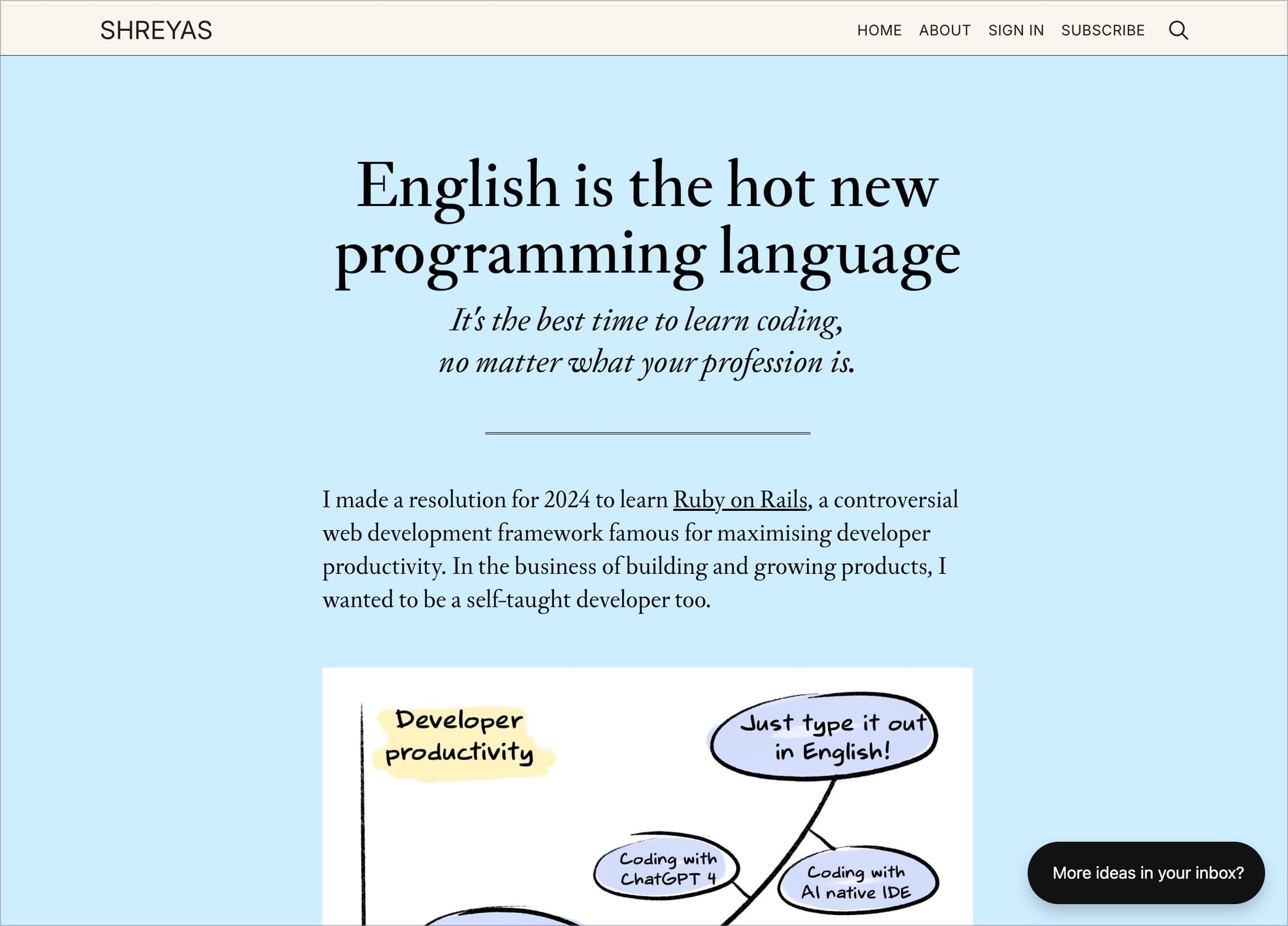
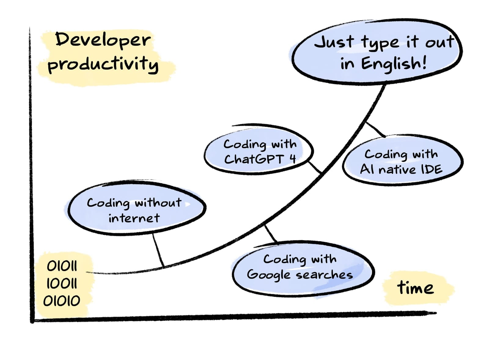
English is the hot new programming language
It's the best time to learn coding, no matter what your profession is.
I made a resolution for 2024 to learn Ruby on Rails, a controversial web development framework famous for maximising developer productivity. In the business of building and growing products, I wanted to be a self-taught developer too.
The goal behind my trite, cliched new-year resolution was to get to a point where I could build apps in a weekend. I have been day-dreaming about a state where—I get a shower-thought, I write code, and in 2-3 hours, I have a production-grade software that’s ready to roll. An end goal of shower-thought driven software engineering was my final objective.
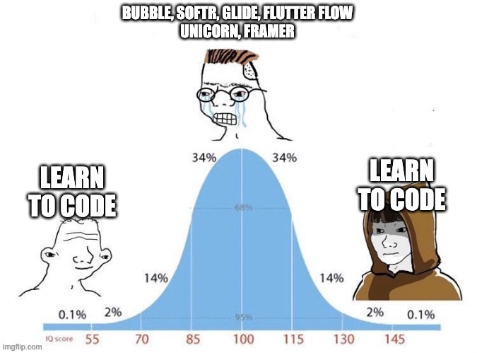
After a brief affair with no-code apps where I tried to achieve this agility (Bubble, Softr, Glide, Framer), I realized that most of these apps were platform-dependent. You couldn’t export your code. You had more lock-ins, and lesser customisations. It was this meme all over again:
I realized that hard-coding was the only way. So I dived deep into Ruby on Rails this year. And to ingest and digest it as much as I can, I’ve been racing past the Learn Enough tutorials by Michael Hartl for the last two months. I also ended up binge watching screencasts from Ryan Kulp’s Founder Hacker course for an added perspective. The first red-pill moment was when I built my first ruby script to solve my own scratch on making wikipedia imports into Obsidian easier, I started gaining more technical sophistication to make quick things and ship it for myself.
My progress in hacking my way around, learning about enough coding to be dangerous, and also racing through different steps of the web development (Git, IDEs, HTML, TypescriptCSS, JS, Ruby, Ruby on Rails) would have not been possible without asking the most stupidest of my questions to ChatGPT as a newbie, amateur, rookie developer.
From the Founder Hacker course, where Ryan Kulp builds a Ruby on Rails app live on Youtube
I’ve found bugs in the code, copied the error without understanding into ChatGPT and then again back to the IDE to make changes and see if it works. And I’ve realised that the barrier for designers to code and bring their designs to life is getting narrower over time. You’re literally ‘spellcasting’ to get your code out, by just chatting with the LLM.
From tl;draw to Diagram and Galileo AI, we’re seeing instances where prototypes are being built at the speed of the ‘mouth’. Every type of programming becomes a conversational design piece – text to text, text to video, text to code, text to game, text to UI, text to 3D prints, etc.
Just unveiled at #Config2023: The first-ever demo of Genius by @diagram, now part of the Figma team. pic.twitter.com/0KxQViOz64
— Figma (@figma) June 22, 2023
The moment is here! Galileo AI is opening up sign-ups for our private beta.
— Galileo AI (@Galileo_AI) October 24, 2023
If you want immediate access and to start generating designs for free, reply to this thread to skip the line.
Be more like Alex and use Galileo AI to crush your deadlines. 👇 pic.twitter.com/VwnFp0GtSB
Over time, I’ve realised that I am not actually learning Ruby on Rails. I’m learning a way to ask around and figure out in plain English. I’m building stuff by prompting. To name a few:
- A simple web UI
- A telegram chat for meal planning
- Ruby on Rails UI components adapted to TailwindCSS
LLMs are the closest thing in the real world to magic, and prompts are the magic spells. Just like spelling wingardium leviosa, you’re typing carefully curated prompts. We’re seeing examples such as Promptbase where prompts are secret magic-spells being traded on the marketplaces. (I'd earlier shipped Prompt Hero to ride on this wave)

With the rise of LLM-backed coding assistants, I’m not even copy+pasting into ChatGPT questions anymore. LLMs are being tightly integrated into the codebases through these coding assistants. I’ve been recently using cursor.sh, an AI-native IDE. They can now read, explain code, document code, write code, autocomplete it, diagnose issues, and even perform arbitrary IDE tasks. Everything is pretty cool, right?
In the final stage of developer productivity, AI-native IDEs seem to be the direction where the world is heading. English is the hot new programming language, and I’ve been coding in English using these AI-native IDEs.
We’re now seeing a new breed of design engineers, who could both design and ship code at the same time, improving the production cycle between building and shipping software.
the “design engineer” will evolve to represent the blurring lines between design and code and more of us will become one
— jordan singer (@jsngr) February 12, 2024
it will be both a designer than can now code thanks to AI
and an engineer that can now design because of AI https://t.co/XnWGtY6eWQ
"I think design engineers will be the most sought after role this decade"
— Ridd 🤿 (@ridd_design) February 12, 2024
- @davidhoang https://t.co/pXuLMnFjHG
It somehow seems like a great time for anyone, be it an architect, product manager, roadside cartoonist, sociologist, to be a design-engineer first. If all we need is english to code and build products, then who is stopping us?
Everyone can now do shower-thought driven software engineering if all that’s needed is crafting good prompts.
Update: Devin enters the chat.
The role of taste in building products
Taste is one of the hardest things to talk about in the product circles. So, let's talk about taste.
Take Marc Lou, a familiar figure within the Twitter Indiehacking circle. He's garnered attention for openly sharing his journey as a product builder. This transparency has piqued interest in his projects well before their launch, as followers have grown to appreciate his distinctive approach. A notable instance of this was the excitement around his AI logo generator, which swiftly climbed to the top spot on Product Hunt. Despite its remarkable simplicity, the product captured the audience's attention, largely because the audience already understood the creator's taste.


LogoFast on Product Hunt
Unlike indie hackers, and other product builders, companies do prioritise rigorous A/B testing and data-driven decision-making. As the projects involve larger teams, and processes, they subscribe to the philosophy of 'letting the data do the talking'. Take this snippet from Flo Health's Medium blog here for example. Each and every feature is rigorously tested and experimented before going live.
However, a shift is occurring in this mindset.
People are considering taste and sensibility, despite the fact that taste is one of the hardest things to talk about.
Brie Wolfson describes this inexplicability in his essay on Taste—
When I ask people what they mean by “taste,” they’ll stumble around for a bit and eventually land on something like “you know it when you see it,” or “it’s in the eye of the beholder.” I understand. Words like taste are hard to pin down, perhaps because they describe a sensibility more than any particular quality, a particular thing. We’re inclined to leave them unencumbered by a definition, to preserve their ability to shift shapes. But I don’t think we have to. And for the past several months, I haven’t been able to resist the urge to try to articulate taste.
This comes, in part, from a place of wanting to be precise — now that the term is such a frequent and varied part of our lexicon, it runs the risk of losing its meaning. But I also believe taste is something we can and should try to cultivate. Not because taste itself is a virtue, per se, but because I’ve found a taste-filled life to be a richer one. To pursue it is to appreciate ourselves, each other, and the stuff we’re surrounded by a whole lot more. So, how to wrap my arms around this term in a way that captures its spirit without flattening it?
I can’t think of a piece of writing that does this more effectively than Susan Sontag’s “Notes on ‘Camp.’” In her words, “a sensibility is one of the hardest things to talk about... To snare a sensibility in words, especially one that is alive and powerful, one must be tentative and nimble. The form of jottings, rather than an essay (with its claim to a linear, consecutive argument), seemed more appropriate for getting down something of this particular fugitive sensibility.”
Consider the approach of Linear, a company that diverges from the data-dominated decision-making model. Linear emphasizes the importance of taste and opinion in validating ideas and assumptions, rather than relying solely on A/B testing and metrics. This approach is about trusting one's gut in a product's readiness for launch, based on qualitative feedback and iterative improvements.
This perspective is shared by Jason Fried, Co-Founder of 37 Signals (makers of Basecamp and Hey). Fried challenges the notion that everything must be A/B tested, questioning the practicality and relevance of 'statistical significance.'
He argues for a more holistic view of success, focusing on overall profitability rather than the minutiae of individual product performance. Yet, the essence of 'taste' remains somewhat enigmatic. It involves an understanding of what makes a project or product resonate, balancing quality, appeal, and budget.
But there are some great examples showcasing this. Apple's approach to sustainability reporting exemplifies this. Apple provided a new spin to the boring 10-page report format, focusing instead on a creative ad campaign outlining their efforts in a smart, eye-catchy fashion. They could have done the same thing in a more convenient format, but they chose to do it differently.
Apple provided a new spin to the boring 10-page report format, focusing instead on a creative ad campaign outlining their efforts in a smart, eye-catchy fashion.
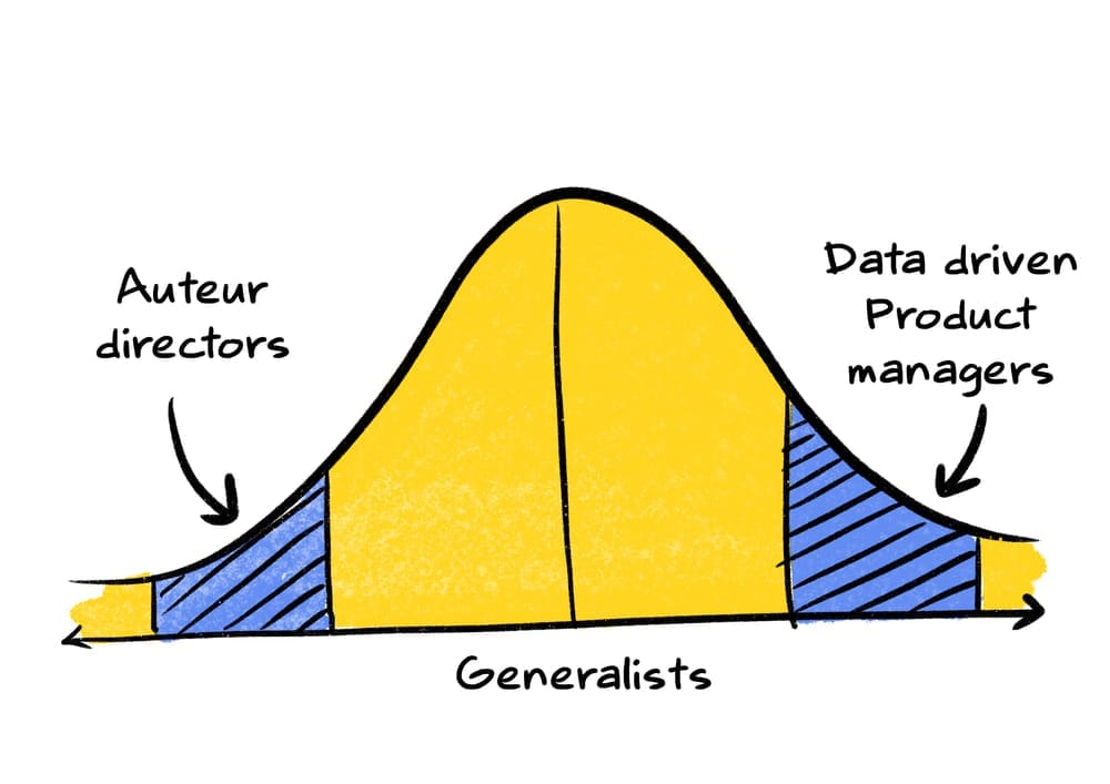
As Brent Schlender describes in "Becoming Steve Jobs," Apple's resurgence from near-bankruptcy was driven by Jobs' ability to harness 'trusted auteur directors' to realize a singular vision. Airbnb's Brian Chesky also embodies this concept of taste. His 15-year journey in developing a nuanced understanding of both the demand and supply sides of Airbnb's service has culminated in a distinct, qualitative essence that defines the brand.
Taste is nothing but intuition translated to action. It's your System 1 in action. A firefighter immediately notices thick smoke billowing from the house. All the years of training and experience has honed his instincts, and snap-second judgements. In split seconds, the firefighter is deciding on calls to backup, begin immediate entry, as well as identify escape routes to rescue victims.
Taste is nothing but intuition translated to action.
Who should steer the course of a product's development – data-driven product managers or visionary auteurs? Should the focus be on relentlessly testing every modification and feature addition, or should we trust in the guidance of these auteur directors to fulfill their promise of impeccable taste?
World's most ancient public health problem
Maternal mortality rates have remained stubbornly static over the past 8 years, and in some countries, from the United States to Venezuela, they have risen.
From the place I come from, in Kerala, a baby is not given a name until he/she is 28 days old. And for marginalised castes/communities, the naming ceremony is delayed to 90 days. I never really questioned as to why this was the case. I let it become a ritual system until I overheard a conversation between some of our family members. This was mainly because the chances of a baby surviving was very low in our previous times. So our forefathers temporarily delayed the naming ceremony to avoid the emotional downpour if things go south. And for marginalised communities, the mortality rate was even more low owing to the difficult circumstances.
Knowing this reality shocked me. We might have more complex challenges facing the world right now — AI taking people’s jobs, climate change induced shock waves, food insecurities, refugee rights, future pandemics etc. But I believe that the cause of addressing maternal deaths requires the most urgency. When a mother dies during childbirth, the future dies with her.
This death happens 800 times a day. Worldwide. Once every two minutes, a mother dies from complications due to childbirth.
By the time you would have finished reading this introduction, there might have been a few maternal deaths.
It’s a remarkable irony that we’re still way off when it comes to maternal mortality rate. Even despite breakthrough progress in wide range of global challenges. AIDS medicines, contraceptives, bed nets to prevent malaria, childhood vaccines, even Tuberculosis for that matter.
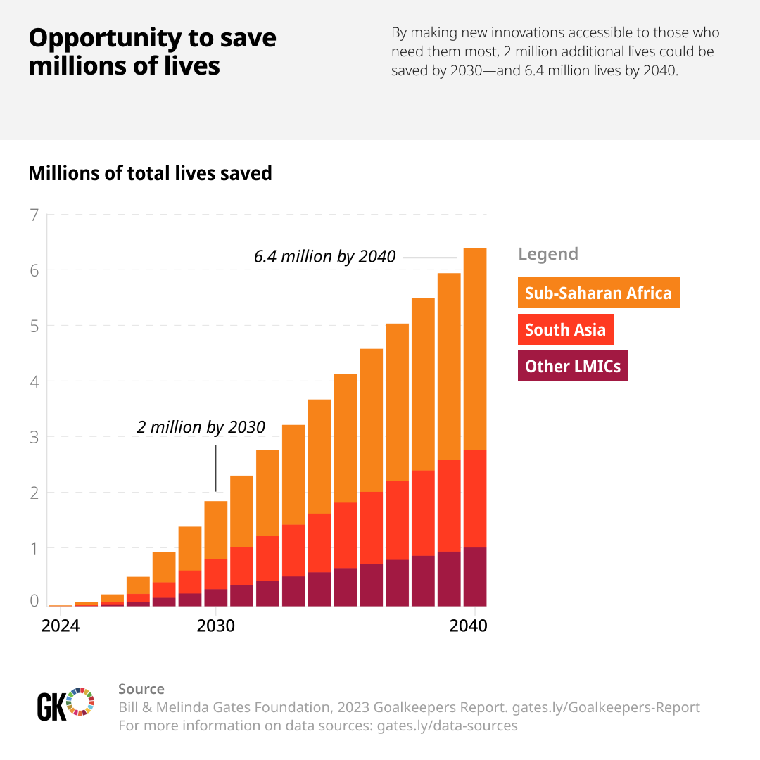
If you notice the figure below, you’ll only see a 3% annual decline from 2000. We’re way off the SDG target of reaching less than 70 deaths per 100,000 live births.
It’s also a strange problem as it’s not just solved by overall economic development of the respective country. Globally, maternal mortality rates have remained stubbornly static over the past eight years, and in some countries, from the United States to Venezuela, they have risen. 2
Let that sink in a bit. United States has seen a surprising rise in their MMR post COVID. The death rates of black mothers in UK and US have doubled since 1999. There is a huge opportunity for all of us to save millions of lives. If we are able to make more innovations accessible to the LMIC countries, almost 6.4 million lives could be saved by 2040.
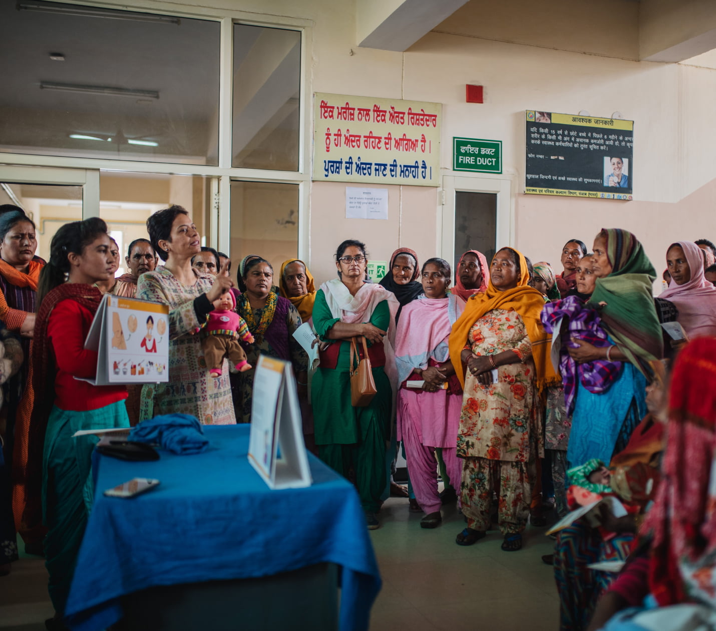
We need innovations of all forms to tackle this. Not just technical innovations, but we need systemic innovations too. At Noora Health, we understand the power of health education training, and how that could have a profound impact for parents and their families. Our way of tackling this challenge has been through the systemic front.
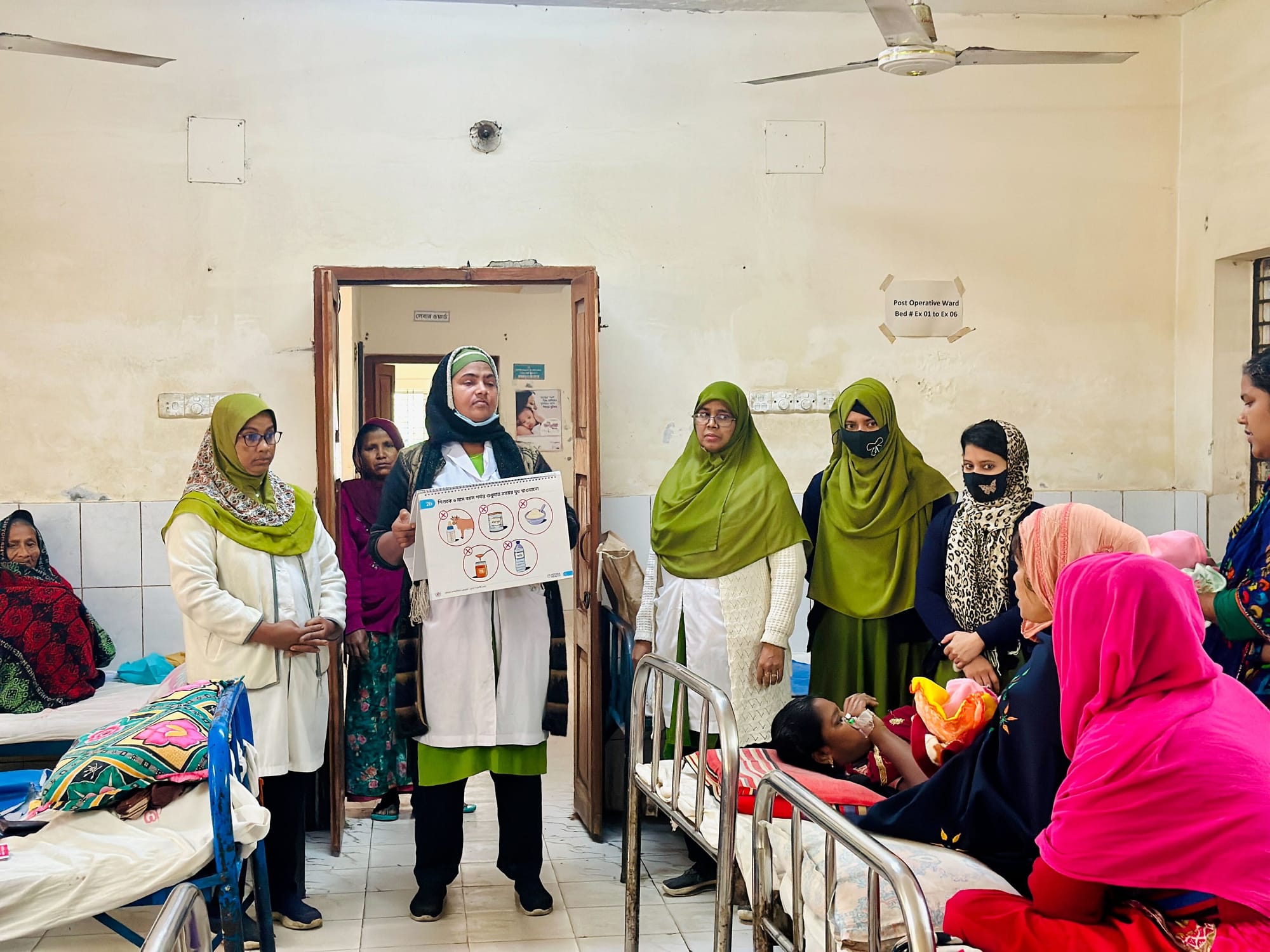
An example of how we do service walkthroughs at Noora Health
By providing the right information at the right time, the curriculum is able to help new parents and their loved ones navigate this journey. For newly delivered mothers, it could be the first days for a newborn. For an expectant mother, it could be during the entire antenatal period.
Once a patient is discharged from the hospital, it’s the family who takes care of them. By imparting health education to the family, various risks are avoided. We want to tap into this unlimited resource. This, to us, is a systemic innovation as the desire to help people we love is universal.
The Care Companion Program (CCP) model at Noora Health is uniquely designed around a set of principles that are known to promote behavior change, but aren’t often implemented and rarely in combination:
- Family Centered, engaging the family member vs. the patient who is often exhausted and trying to recover;
- Timely, providing caregivers what they need when they need it;
- Trust-Based, anchoring on healthcare staff who families trust,
- Skills Oriented, focusing on equipping families with actionable skills that drive health outcomes;
- Reinforcing, supporting caregivers throughout their journey from the hospital to home, not just at one time.
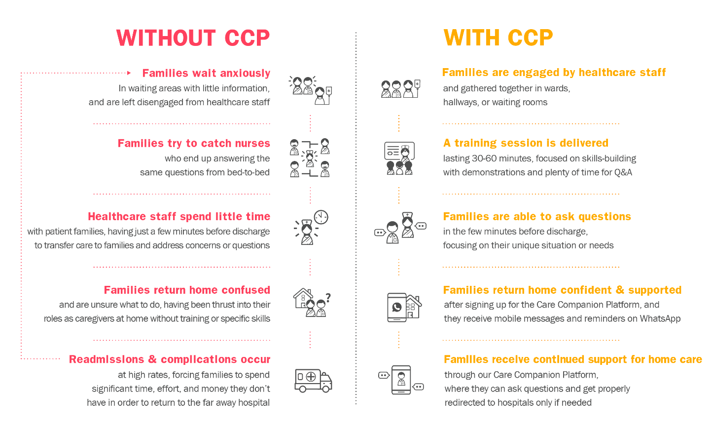
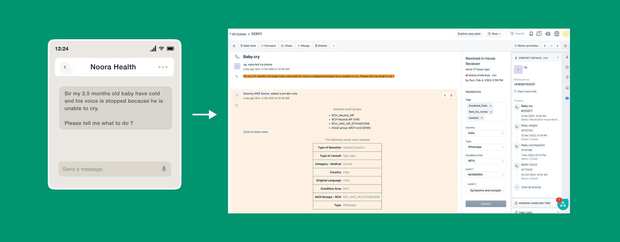
After leaving healthcare facilities, caregivers have access to the Noora-managed Care Companion Platform, which helps reinforce and supplement the skills and information received. Caregivers sign-up at the hospital, and then receive tailored information at scheduled points in time, including reminders and new content, most often via WhatsApp.
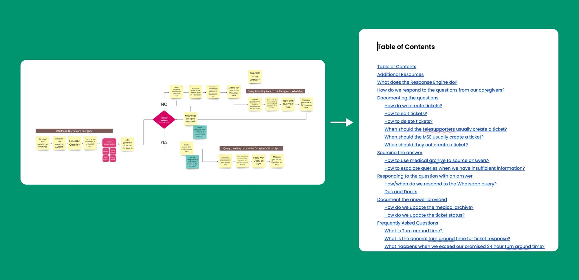
The Platform also provides on-demand support. Caregivers can ask questions that are fielded by Noora’s clinical team of nurses, who either clarify or supplement behavior change advice (e.g., steps for wound care, diet advice for diabetics), or provide advice on when symptoms warrant a healthcare facility visit.
While this level of support may seem daunting to provide at scale, 95% of the questions received can be answered from a bank of Frequently Asked Questions and only 5% require escalation to our team of doctors and specialists.
In this way, by looking at health education through a more systemic lens, we’re able to provide crucial information for the caregivers at each and every phase of their journey.
Dear enterprises, we're tired of your subscriptions
Software is eating the world. But are we eating it the right way?
When you build a SaaS app, how do you price it? The first option which comes to everyone's mind is a monthly/yearly subscription model.
While building Clarity notes, I was stuck with a usual question when it comes to building a SaaS—How should I price the app? We settled on the usual monthly/yearly pricing structure. It included a free version to allow users to try out the YouTube note-taking feature as well as a Pro Plan involving all the advanced features not available in the free version. We also tailored an Academic Plan, offering students an affordable option to take notes on YouTube.
I was not an expert in pricing while launching this app. However, it took me time to explore the various options available for pricing in general. If we take the mythical thirty thousand foot view, no matter what we’re actually doing with pricing, whether it’s a — non profit, retail, SaaS, DTC etc — we’re ultimate in the business of value creation. Price, after all, is the exchange rate on the value we’re creating in the world. In Pricing 101, the monthly subscription plan is just one of the many possibilities to set the pricing. There are multiple such value metrics, such as — per seat per 1000 visits, per CPA, per GB used, per transaction etc.
Circling back to the value metric of a monthly subscription we tried out for Clarity Notes, when viewed in isolation, this case might appear appealing — after all, who wouldn’t be tempted by a service costing less than a cup of coffee a month?
Yet, when considering the broader context of numerous SaaS apps and subscriptions vying for a user’s attention, the allure diminishes. In today’s gig economy, there’s a growing trend towards renting rather than owning everything — from daily news sources like the New Yorker to music playlists on Spotify, and even on-demand video services like Netflix and YouTube.
Sure, there are some costs associated with running software — ranging from customer support, cloud storage etc that could justify the monthly subscription model?
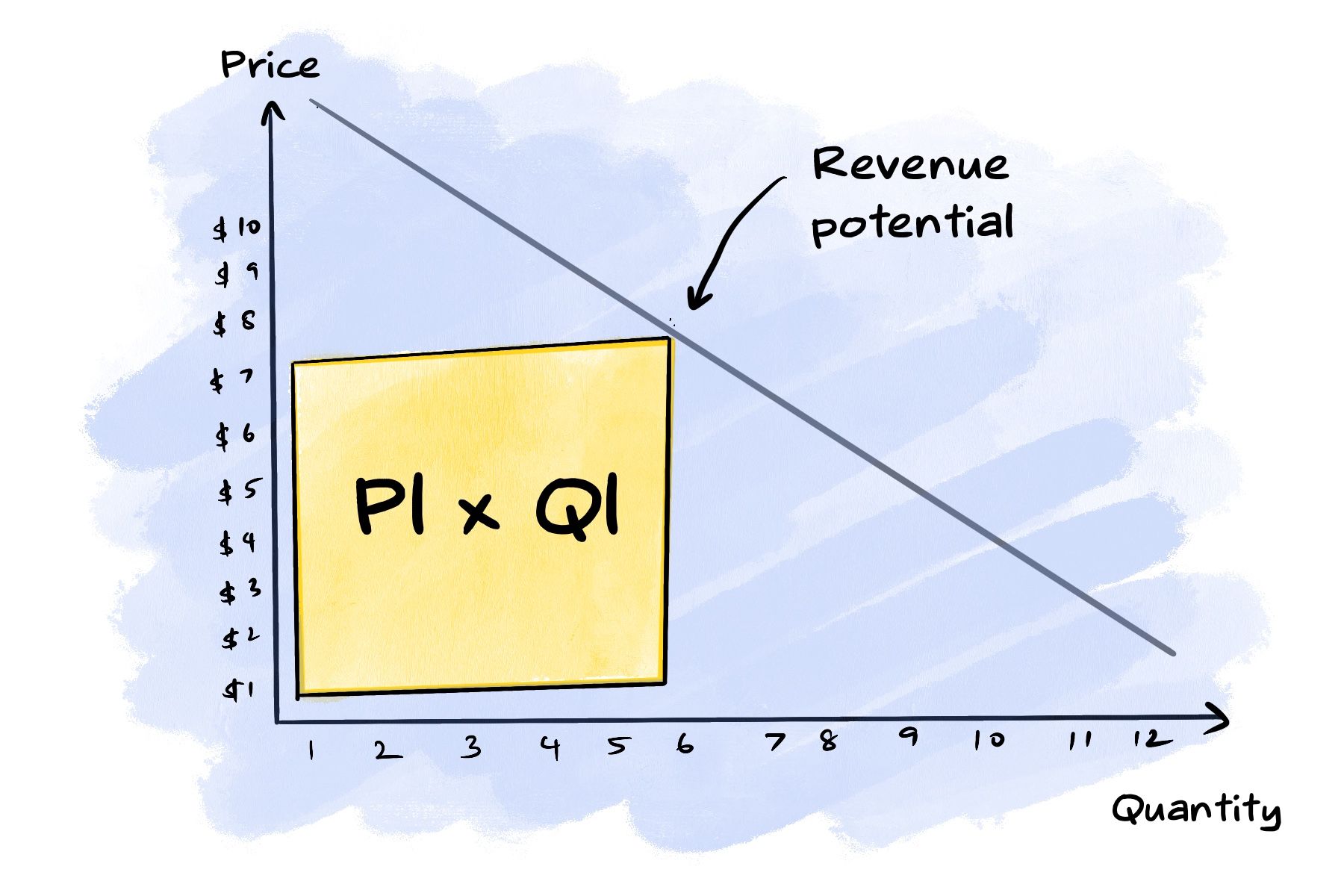
I came across this graph in Lenny’s newsletter which depicts the opportunity cost of not setting the pricing to the right value metric. We’re missing out on revenue by charging just a flat monthly pricing.
If you remember back to your high school or college economics class, the professor put a point on a demand curve for the perfect price and said “the revenue a firm gets is the area under that point.”
The problem here is — what about all that other area under the curve? You’re missing out on that revenue by charging a flat monthly fee.
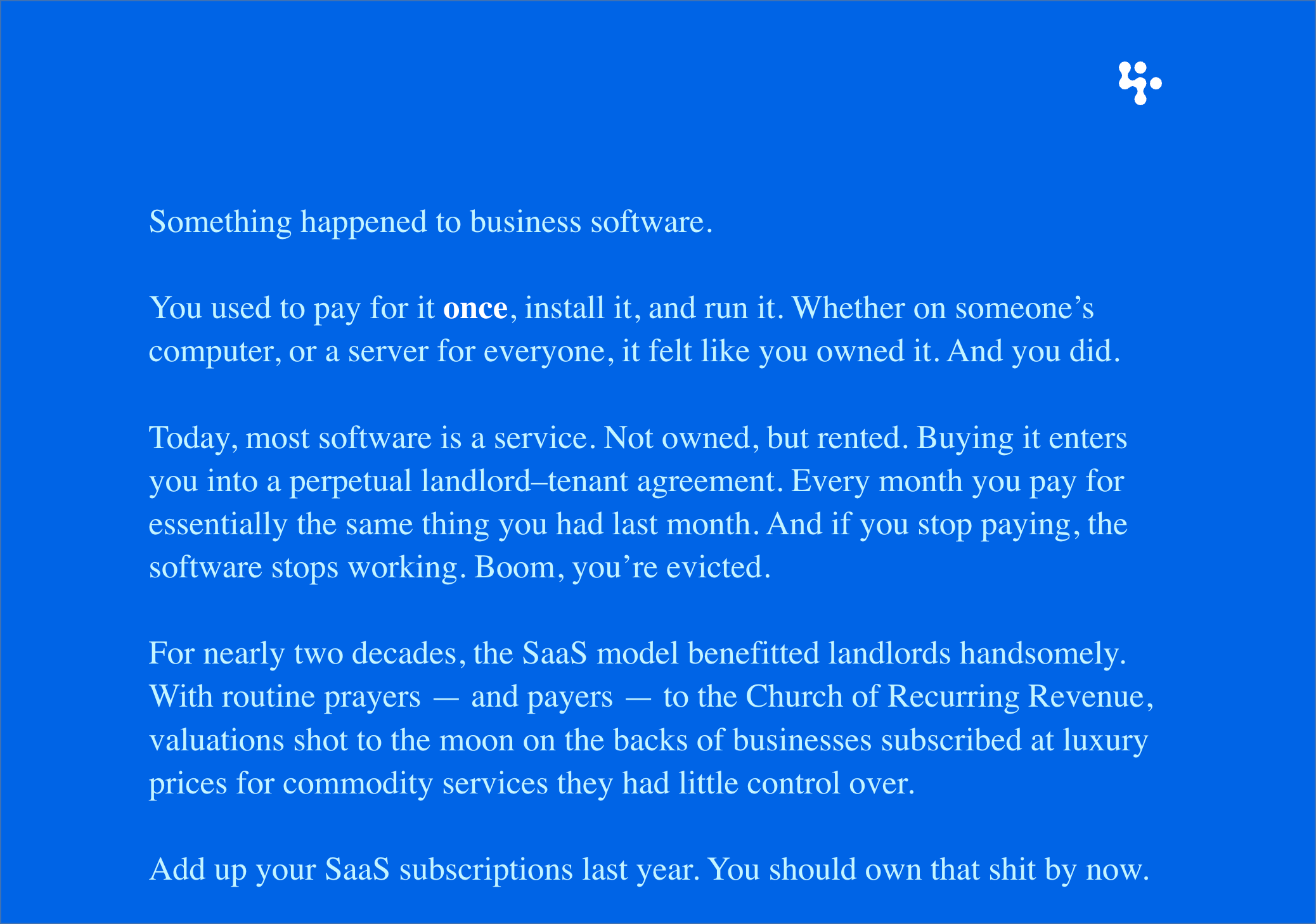
37signals rolled out an antidote to SaaS monthly subscriptions models with Once, which is a heretic to what it calls the “Church of Recurring Revenue” by selling software the old fashioned way: pay once and host the software. Just because software isn’t sold in a box doesn’t mean it has to be a subscription. “The post-SaaS era is around the corner,” promises Jason Fried, CEO of 37signals.
SaaS still makes sense for many products, but its grip will slip. Installation and administration used to be hopelessly complicated, but self–hosting tech is simpler now and vastly improved. Plus, IT departments are hungry to run their own IT again, tired of being subservient to Big Tech’s reign clouds — Jason Fried
Enterprises might also be facing various other hidden costs apart from hosting tech and providing customer support. Take this software for example — Audionotes.pro
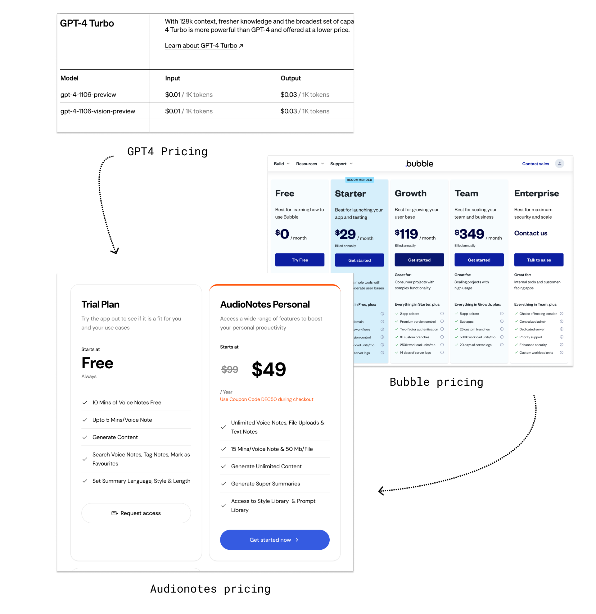
It’s an application helping you take automatic transcriptions of your audio notes. Audionotes is basically a Bubble application made on top of a GPT-4 API helping process and summarise notes better. It’s a wrapper on top of a subscription wrapper (Bubble) on top of another subscription wrapper (GPT4 API). And we pay for all the wrappers together (as a subscription)
In the long term, the users pay the brunt and might churn from opting into these subscriptions. (It’s one big pyramid scheme of subscriptions for the user). We also cannot blame the enterprises as they are also heavily dependent on various other enterprises offered as subscriptions.
Taking these factors into account, I’ve realised that Clarity notes is not just competing with other Youtube note taking apps, it’s also competing with Youtube, Netflix, Spotify etc. All of us are eating into the same monthly salary, piece by piece.
Which makes us think — Are there any alternative pricing models when it comes to SaaS products?
We’re seeing various innovations in SaaS pricing. Let’s look at five different software pricing models that don’t default to a monthly subscription model.
Lifetime deals
Once you purchase and redeem a lifetime deal, you have access to that tool for the lifetime of the product.
This might seem like a great option for users. You pay once and forget about it. The company also can benefit from the immediate capital injection. They are phenomenal for getting early adopters onboarded FAST.
However, growth might slow down when the lifetime deals end. In this regard, monthly subscriptions are considered a more sustainable offer for the enterprises.
Not just that, with lifetime deals, there is also this risk of complacency in updating and adding new features. However, in subscription models, this comes as a part of the package. Indiehackers place their apps in SaaS boutiques such as Appsumo for getting more visibility.
Lifetime deals + Monthly subscriptions
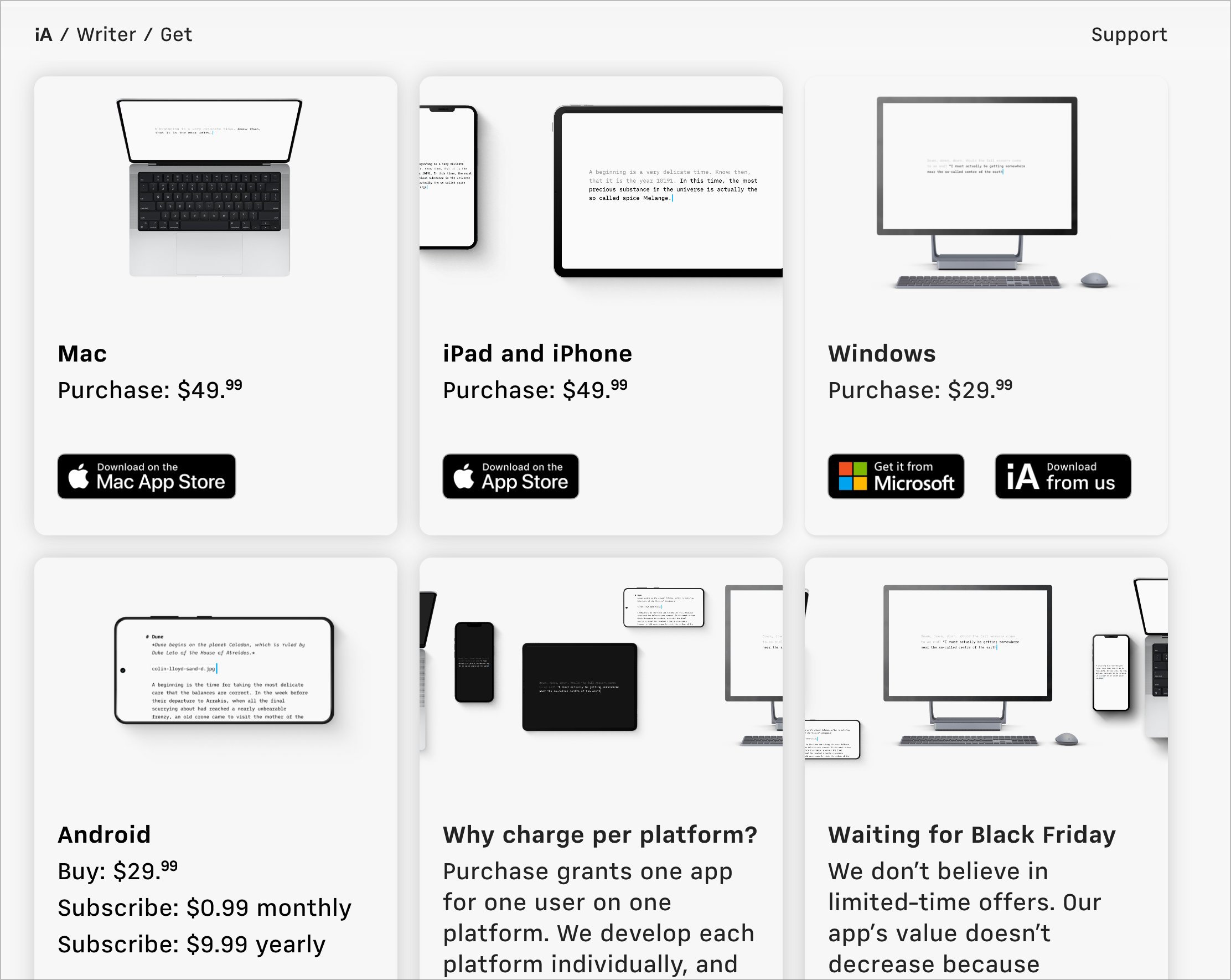
iA, the popular writing software has a very contrary take on their SaaS pricing. They offer both. They provide the customers and option to either buy or subscribe.
Surprisingly, the revenue share between one-time payments and monthly subscriptions for iA has been a tie—50/50.
Buy Once + Host on your own server
If we circle back on the definition of a lifetime deal — Once you purchase and redeem a lifetime deal, you have access to that tool for the lifetime of the product.
Apart from the quick capital injection, it might not be sustainable for the enterprise as one might still need to pay for the hosting. These marginal costs might creep up over time.
Jason Fried, the CEO of Basecamp has a new spin to the pricing story. Through Once, they plan to provide users the ability to host the software. They just have to pay one-time for the software, and the rest is up to them to host it the way they would like.
Pay per task
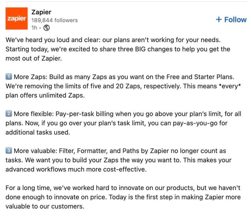
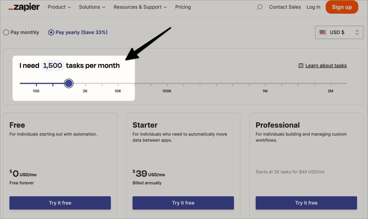
Zapier, a company valued at $5 billion, revolutionized its pricing structure by introducing a “pay-per-task” system, moving away from the traditional monthly subscription model.
Pay-per-task, as an emerging model, reflects a nuanced understanding of customer preferences and a commitment to meeting their specific needs. This shift is likely driven by growing dissatisfaction with monthly subscriptions. Take, for instance, our annual expenditure of approximately $40,000 on Figma. Each monthly bill is a reminder of the disconnect between our usage and the costs incurred.
Alternatives like pay-per-pixel, pay-per-project, or one-time purchases are increasingly becoming more appealing.
Software Couture Houses
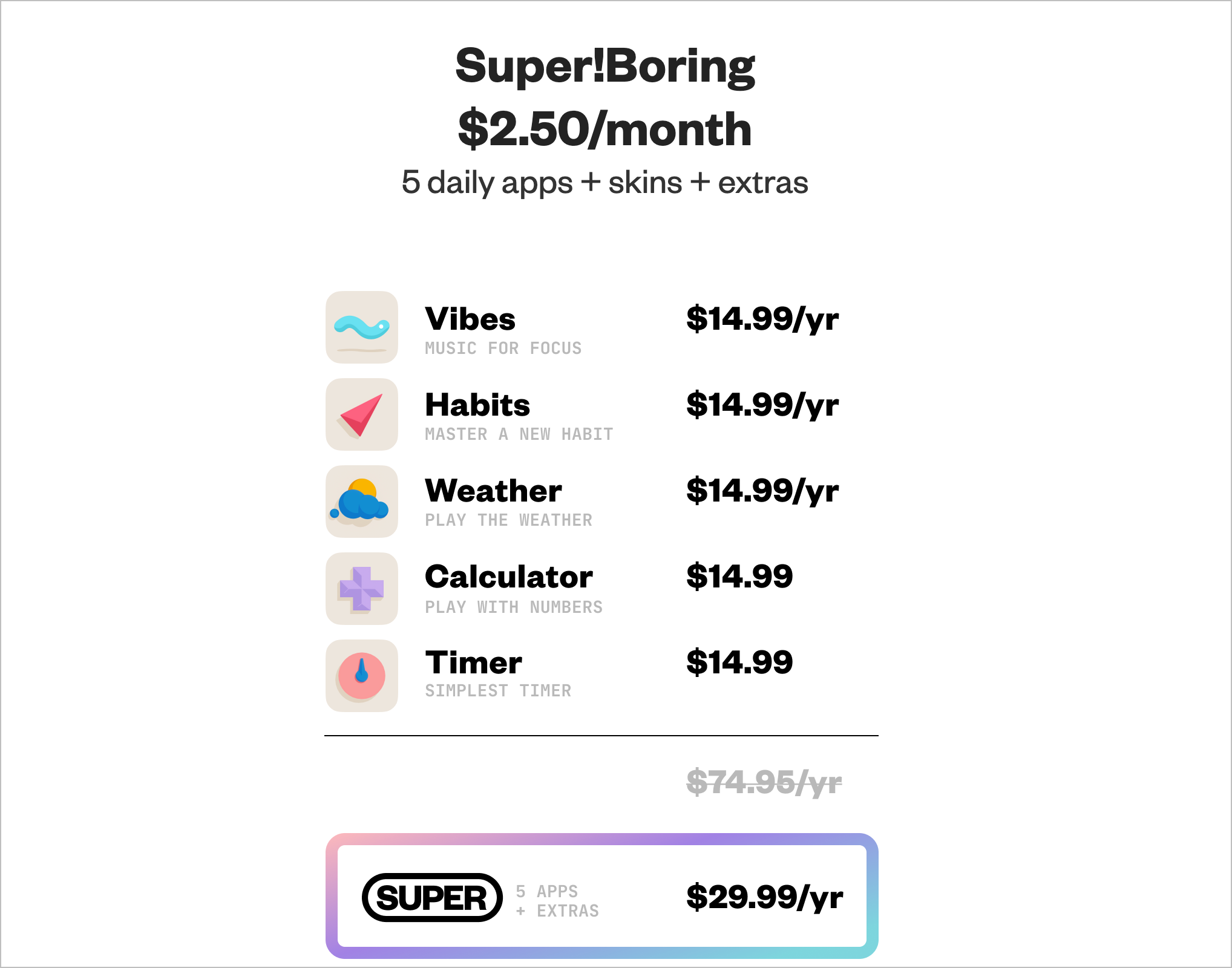
Recently came across Andy’s !Boring — an independently owned software couture house.
Under the !Boring umbrella, Andy has launched a suite of apps — Weather, Calculator, and Timer, (Not Boring) Habits wildly amplifying a pretty mild-mannered category, tearing down the traditional approach in favor of eye-popping aesthetics, zingy haptics, spiffy 3D animations, and plenty of the delight and fun that nabbed the app its 2022 Apple Design Award.
They are designer-labelled, contrarian, and far from the default. As the title claims to ‘ditch the default, and to support interesting’ —
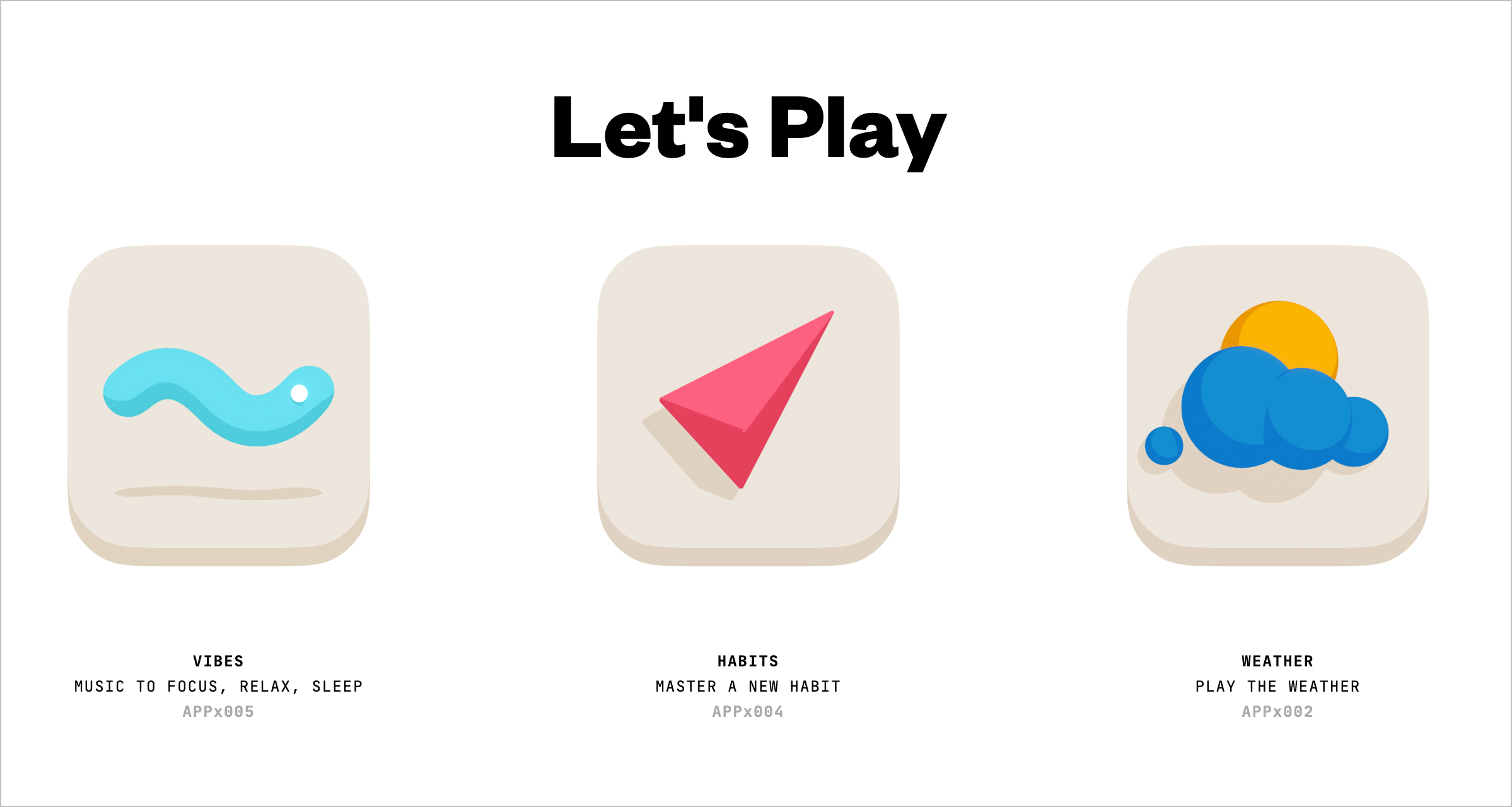
How does the pricing work? — You pay for the membership and get access to the entire range of apps that are developed by Andy. It’s more like a SaaS, but instead of paying for one app, you pay for the whole gamut of apps. It’s a bit different from an aggregator such as Appsumo as it’s not a collection of curated applications.
I foresee many such software couture houses.
What’s next?
Historically, we have always taken the stance of function over form, and to just GET THE JOB DONE. However, this very act has backfired in some cases. People don’t just seek utility, but also fun and delight.
I just wanted to conclude this incomplete essay with a quote by Verganti, a pioneer in design-driven innovation—People don’t buy products. People buy meanings.
Dear enterprises, we’re tired of your subscriptions. We seek newer meanings and want to rethink our relationship with software.
It’s nice to see various such relationships emerge, as shown from the earlier examples — ranging from renting, to owning, to renting partially, to owning a suite of apps, to even renting a suite of apps. Software is eating the world. And let’s make sure that it eats the world the right way.
Products need not be user centered
We've used the word 'user-centered design' infinite times, over and over again. We've even forgotten why we use it.
Putting the user first has always been the golden rule in design. It’s so common that nobody really questions it anymore. We’re told, ‘The user knows best. Listen to them.’
I’ve had my skepticism about the framing of the term — user-centered design. I’ve kept myself from voicing this apprehension, afraid of being dismissed as an outright blasphemy in the design circles. However, having shifted gears from design to PM roles, I feel more comfortable expressing a spicy hot take that — Products need not always be user-centered.
So what’s the problem here with user-centered design?
Imagine you’re crafting a product for Michael Johnson, a fictional character representing the ‘average’ user: a 38-year-old IT project manager juggling work and family life. This approach, while seemingly comprehensive, inadvertently overlooks the diverse spectrum of users with unique needs and preferences. This is the essence of the ‘long tail problem’ as articulated by Kasey Klimes. It states that focusing solely on the average user risks marginalizing those outside this central demographic. The product ends up serving the gaussian middle.
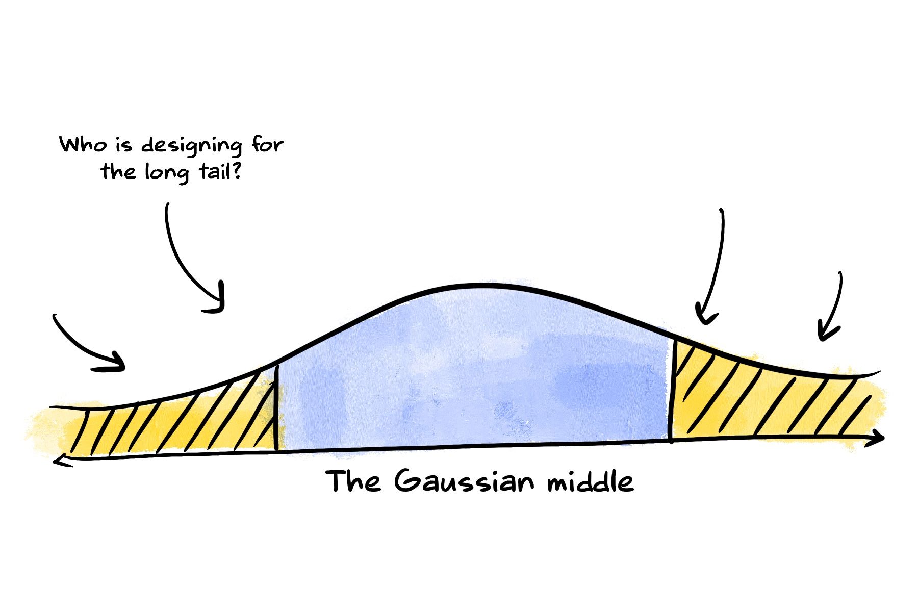
User-centered design by default tends to get optimised for the average. It implies a focus to the right profile of a user. And that’s NOT always the right approach. We just have so much variance in the users, that I sometimes wonder: how do we expand the scope of a product from the gaussian middle to the long tail?
There is a way of addressing the long-tail problem, but it requires a very different paradigm for thinking about the way we design products, tools, and services. We can call this paradigm design for emergence. — Kasey Klimes, Design for emergence
Fortunately, there is a new kid on the block — and that’s design for emergence. This concept finds its roots in Seymour Papert’s emphasis on ‘low floors’ and ‘high ceilings’ in technology. According to him, technology should be accessible for beginners (low floor) yet offer advanced users the scope for complex projects (high ceiling). Think of LEGO, with its simple yet versatile bricks, offering endless creative possibilities — that’s this philosophy brought to life.”

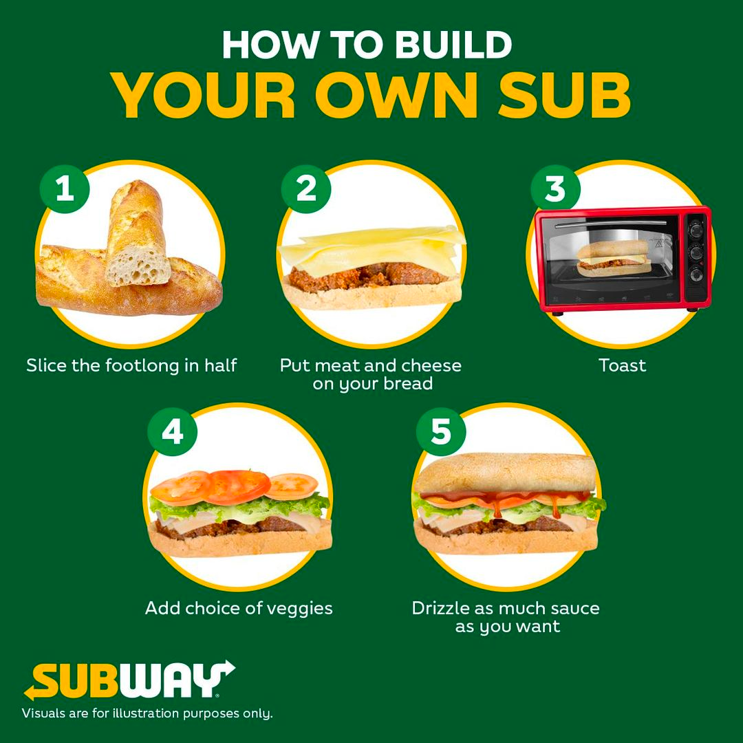
Subway is another example. A sandwich is made composable. You can choose your toppings, the patty, the sauces in a truly unique way. There is no one ‘right’ way for the ‘right’ user. There are multiple ways for multiple users. By designing products with low floors, wide walls and high ceilings, every fringe user can now use the product the way they want it. Even coffee has become ‘composable’ this way.
Designing for emergence is just that. Products with “low floors” and “high ceilings”. Let’s take a couple of digital examples where this has stood out:
Zapier makes automations infinitely composable through its automation blocks
If we classify software in terms of an axes between convention and configurability, on one extreme, you have the DIY types: like Notion built on the principle of composability through content blocks. On the upside, you see people use Notion for all kinds of purposes such as — wiki, project management, CRM, documentation etc. Notion definitely has a high ceiling. However, on the downside, it suffers from ‘too much’ composability leading to featuritis. Features keep getting added, which affects the speed, stability and performance in the core features that defines the essence of Notion (high floor)
Configuration through composability is great. But there are times when you would rather choose a full course buffet curated by a chef, than being given 100 different options to choose and customise on your own. This is where the other extreme lies. Design which chooses convention over configuration. Ruby on Rails is opinionated software, where a team of chefs have picked ingredients on our behalf. As DHH puts it, it isn’t meant to appeal to the taste of everyone, everywhere. This works great when the user doesn’t really know what to look for.
There are lots of à la carte software environments in this world. Places where in order to eat, you must first carefully look over the menu of options to order exactly what you want…Rails is not that.
Rails is omakase. A team of chefs picked out the ingredients, designed the APIs, and arranged the order of consumption on your behalf according to their idea of what would make for a tasty full-stack framework. The menu can be both personal and quirky. It isn’t designed to appeal to the taste of everyone, everywhere.
When we, or in some cases I — as the head chef of the omakase experience that is Rails — decide to include a dish, it’s usually based on our distilled tastes and preferences. I’ve worked in this establishment for a decade. I’ve poured well in the excess of ten thousand hours into Rails. This doesn’t make my tastes right for you, but it certainly means that they’re well formed. — DHH on this blog.
Apparently, it’s not just DHH and Ruby on Rails, but also how Tesla was envisioned by Elon Musk:
This is how we create Tesla products
— Elon Musk (@elonmusk) January 3, 2024
pic.twitter.com/DsmisqDGSp
Taking these different philosophies into account, it would be harmful to consider ‘user-centered’ design as the only way to build products. You can design products in DIY, composable ways as illustrated by LEGO and Roblox. Or in Omakase, conventional way as shown by Ruby on Rails.
Products need not always be user-centered. It can be emergent too, accomodating a varied spectrum of users to use the product.
How might we help children invent for social good?
What surviving an attack from a man-eating tiger has taught me about invention and rural entrepreneurship
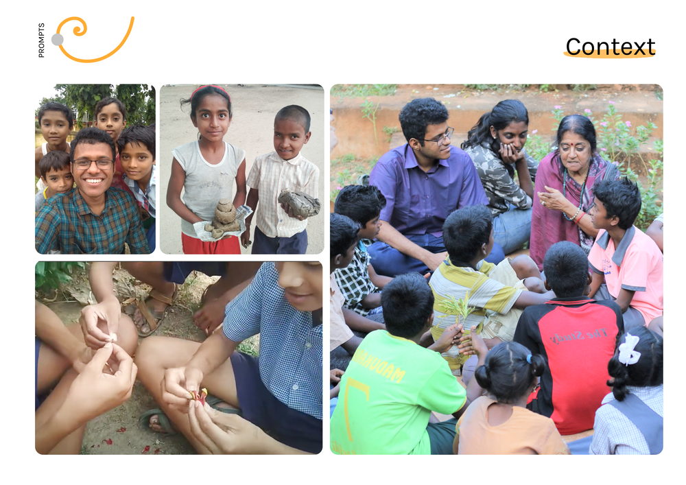
I stayed in a tribal village in India for a year teaching children leadership skills through design thinking. Here’s a story behind my non-profit initiative and how we’ve impacted 1200+ children from 3 rural areas (also a short segway in which I was chased by a man-eating tiger)
Can children invent for social good?
We expect kids to do kids-related work, but what if they stepped up as leaders and gave back to their community? This was the guiding question behind this social initiative.
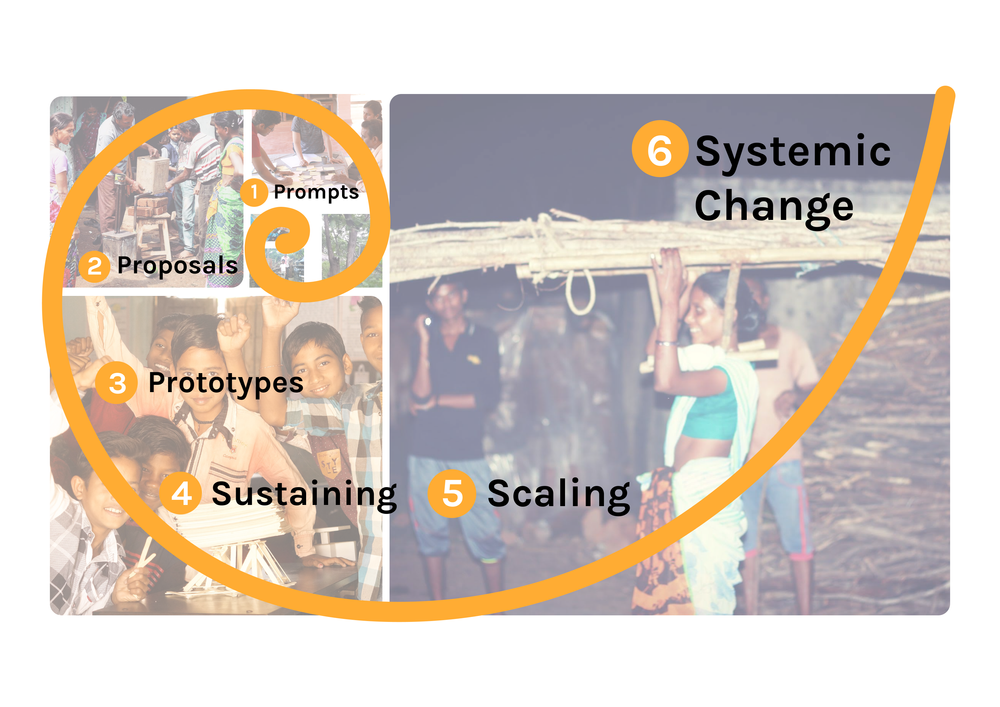
As an impact initiative, we followed the open innovation framework for structuring our work. Systemic change does indeed take time. 1-2-3 or even 5-10 years to have something tangible. Most of the social innovations got stuck at prototype/scaling stage which we wanted to avoid.
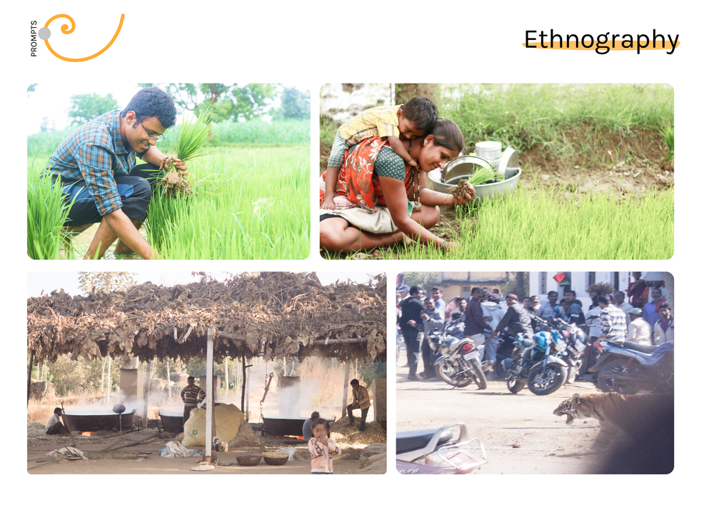
I stayed with the locals in the tribal village of Maharashtra, India to understand the context. To bond with the villagers, I actively involved as a teacher, helped with the jaggery production and rice harvesting. The day ended with copious notes from all the observations.
Lobhi village was quite remote and secluded. Lying amidst a thick forest belt often frequented by leopards and tigers. This is a picture that I took while being chased by one of these man-eating tigers which visited our village during summertime (yes, I live to tell this story)
While working with rural children closely, I was baffled by their creativity. Less was more!
They build upon innovative ideas using fewer resources. They played with flowers, fruits, clay and even dried leaves. The play didn’t require plastic toys or some fancy 3D printers
Yet, at the same time, their creativity was underutilized. 70 percent of India’s workforce resided in rural areas but only 20% of the graduates were workforce ready. The ethnography studies led to the formulation of our social initiative.
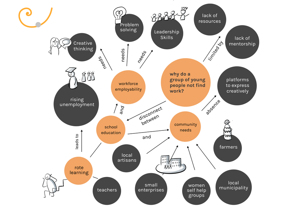
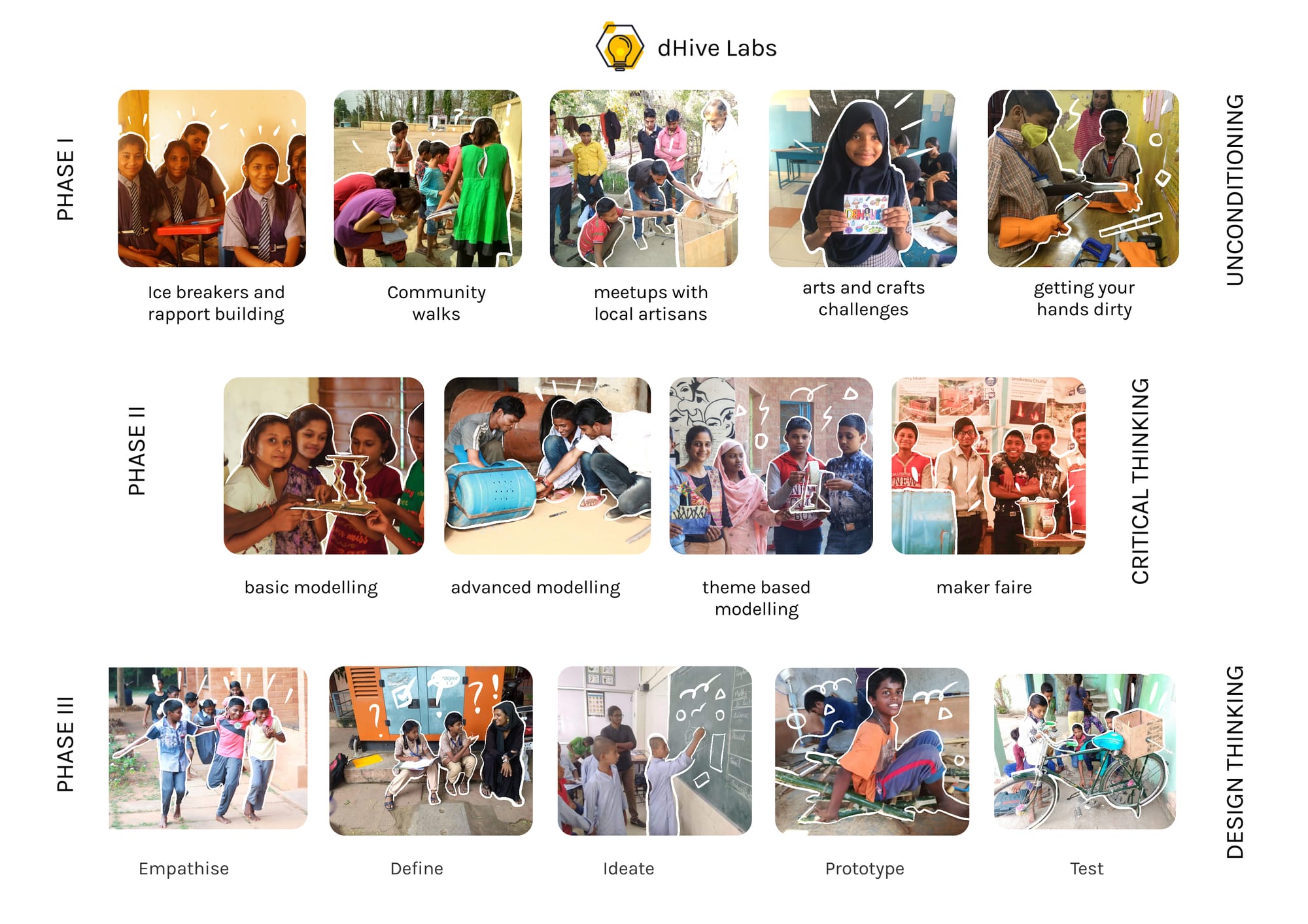
2+ years of experimentation in the form of pilots in rural schools helped us to carve out this program. We aimed at providing leadership skills through design thinking. The program was divided into three phases (unconditioning, critical thinking & design thinking)
Why design? Because design is not just about making cute little drawings, but so much more. You could think about problems critically and solve them. We believed in the vision of nurturing such young changemakers through design.
As a product of the traditional educational system, you had to do a lot of ‘unlearning’ to look at problems differently and to tackle them. The first phase of our program did exactly that. Letting your mind unlearn, and to let your creativity juices to flow more freely.
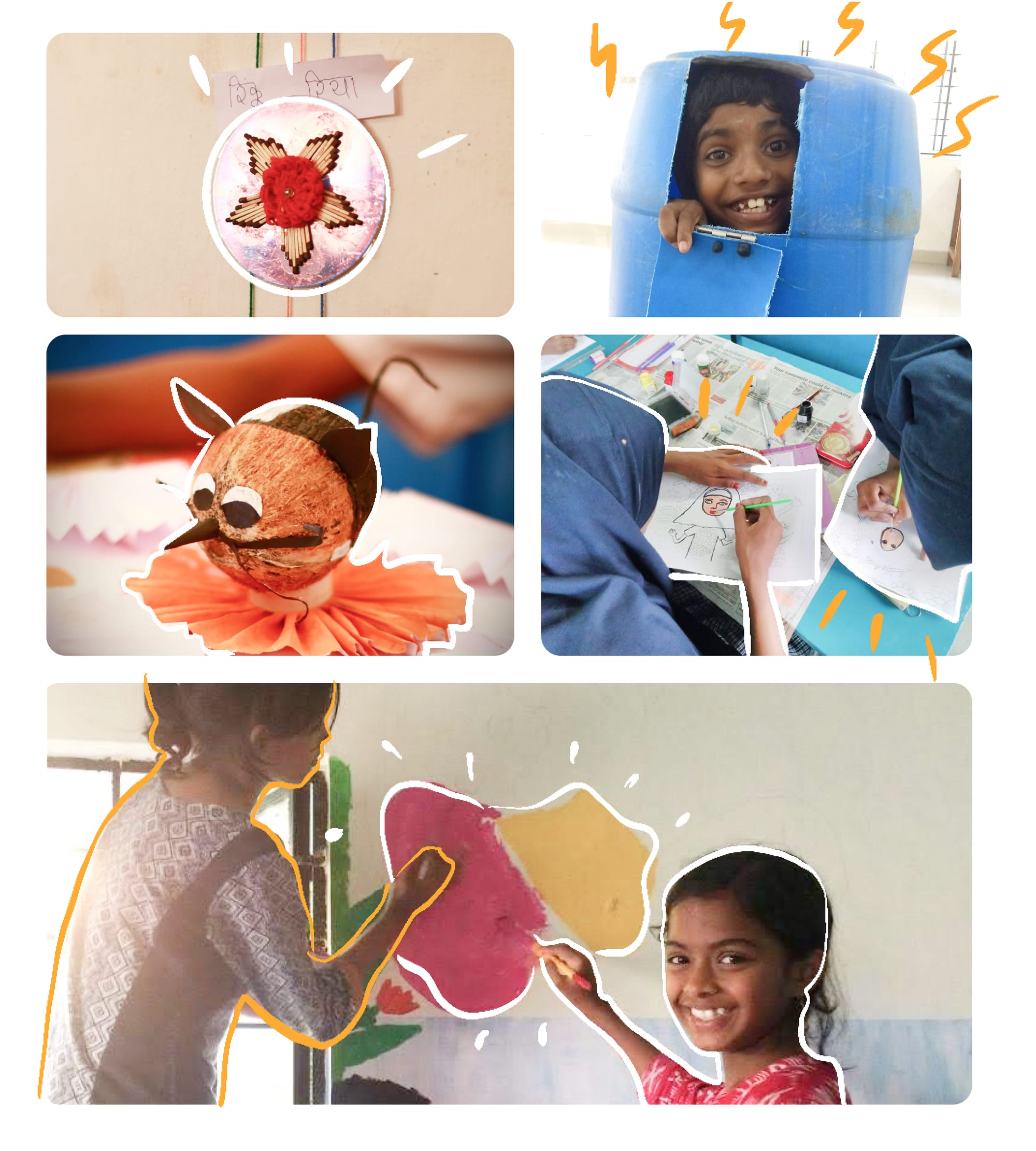
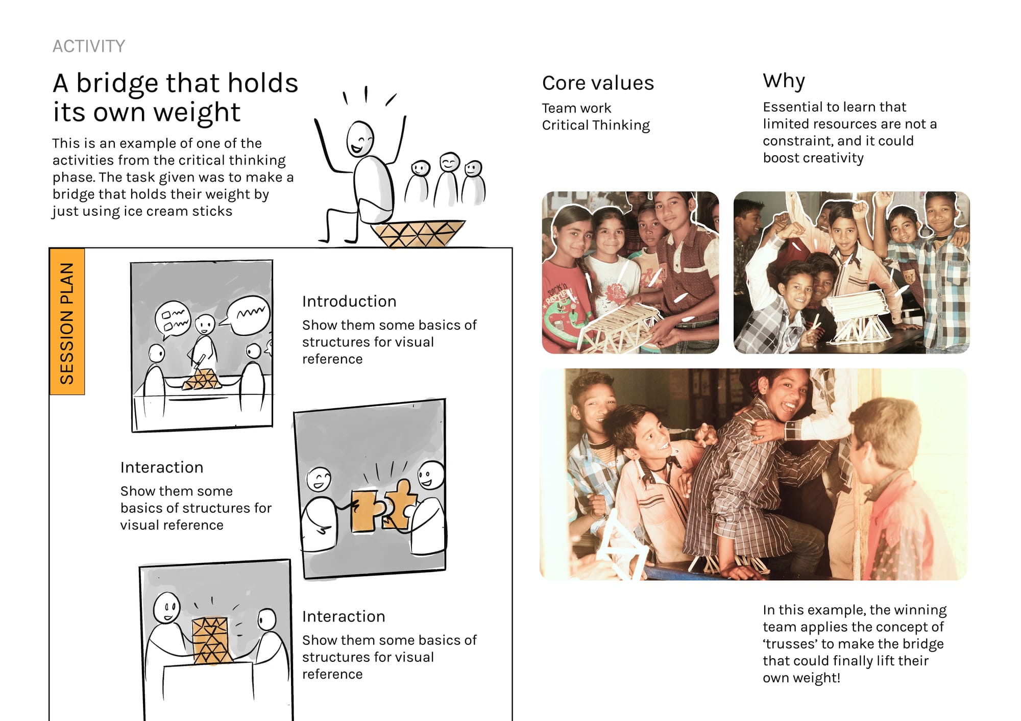
We also observed a lot of students getting stuck with creative block to build and explore. So we designed various challenges to create an enriched visual library of mechanisms, structures, materials and applied science/maths for the kids
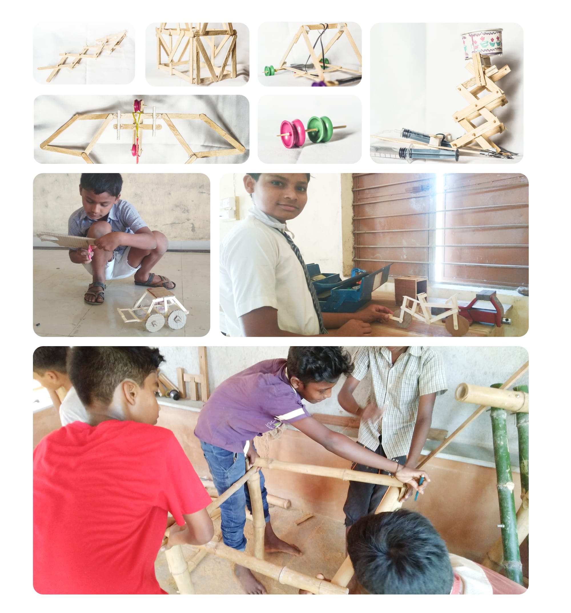
This is one such example from an activity which we designed. The challenge was to build a bridge that could hold their own weight using popsicle sticks
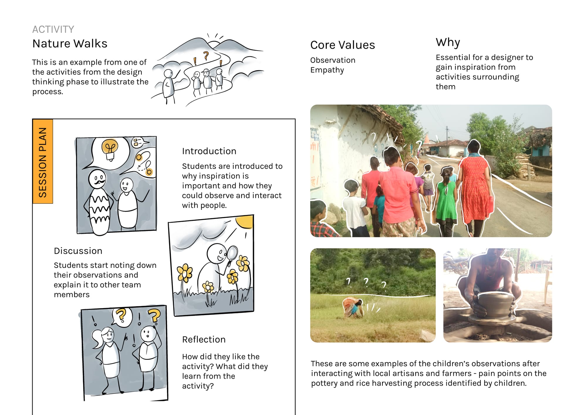
This is another such example from the design thinking phase. The students were asked to go for nature walks and document their observations. In this manner, the core values of observation, empathy and team work were reinforced among our children.
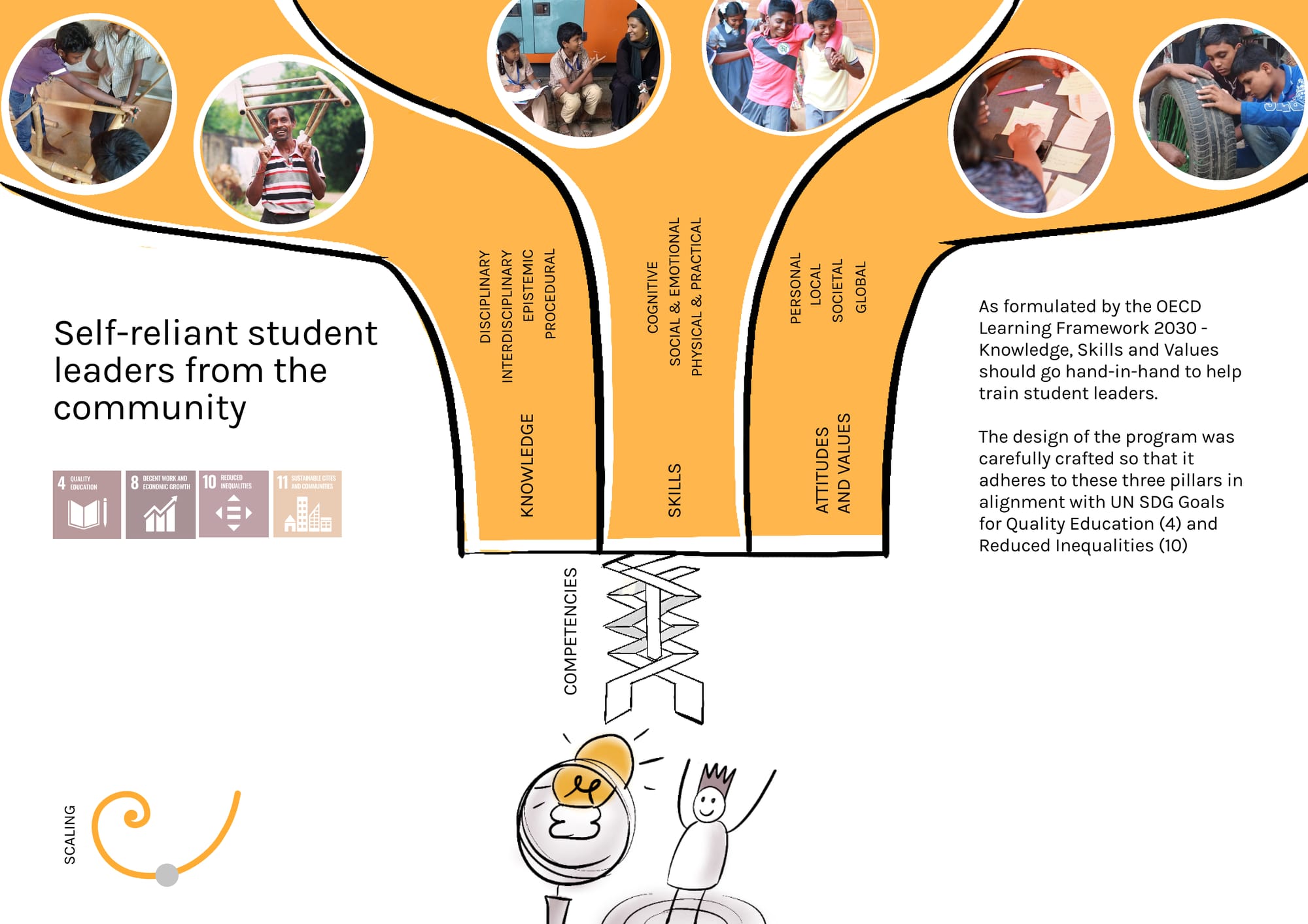
The vision was focused towards building self-reliant student leaders from the community. The OECD Learning Framework 2030 was followed to make sure that the knowledge, skills and values were aligned through our curriculum.
The tap (money) shouldn’t run dry, even if it is for a good cause. So we systematically injected funds through external grant agencies and crowdfunding support. The financial capital was leveraged along with social capital (media, mentors, hackathons) to scale impact.
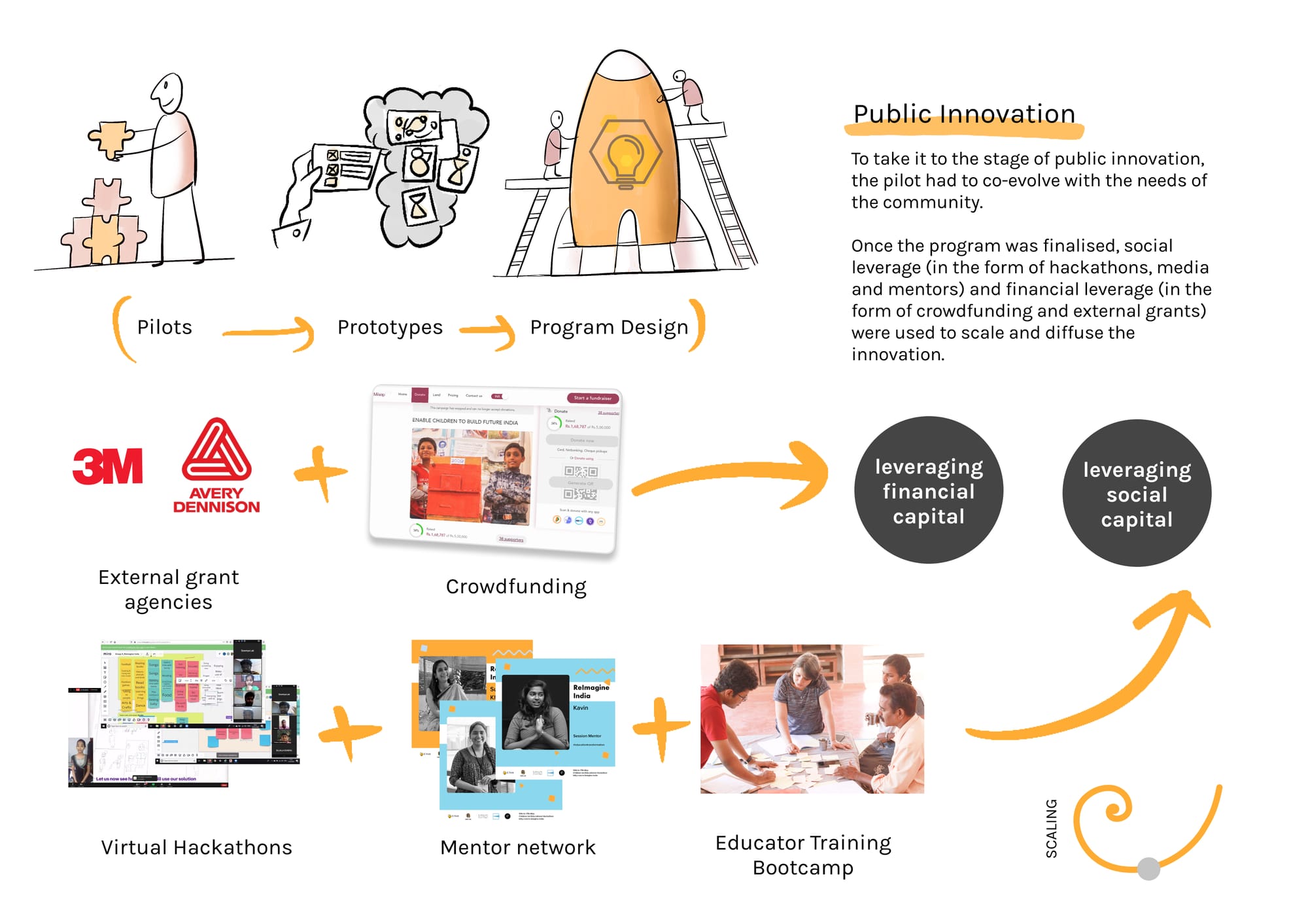
Will take you through some examples which I personally consider as a ‘systemic change’ for the communities.
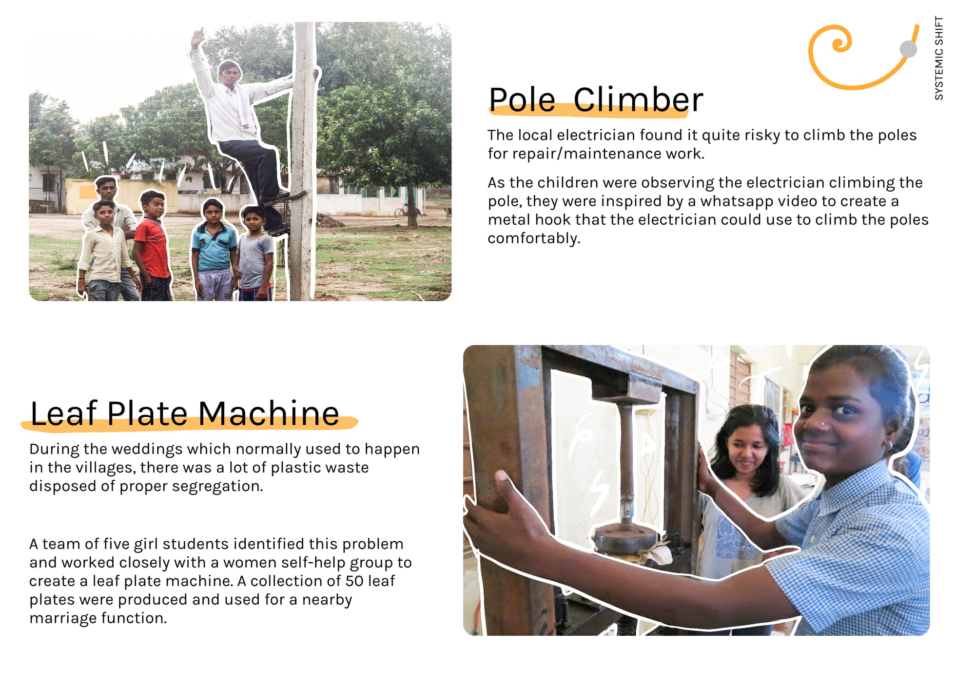
Our students build 12+ innovations over the course of time. The beauty of these innovations were the simplicity and resourcefulness and the ‘jugaad’ (frugal mindset). Local solutions developed locally by the locals
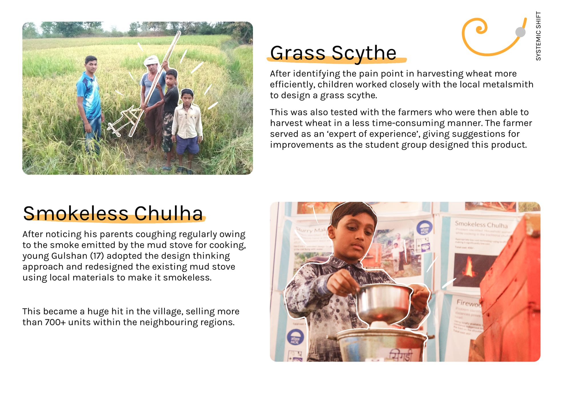
Among the innovations included a pole climber (risk free climbing of poles by electricians), smokeless chulha (smoke-free mud stove), grass scythe (for wheat harvesting), leaf plate machine (local production of sustainable leaf based plates) etc
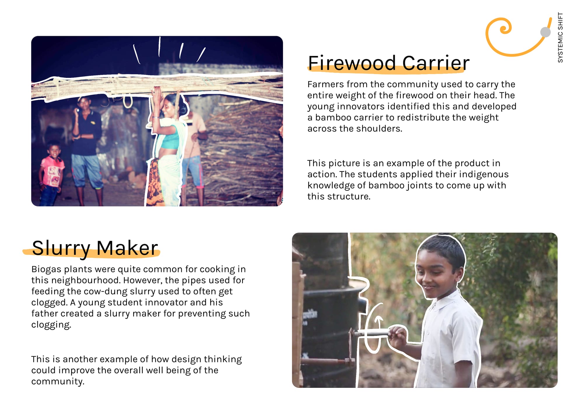
Firewood carrier: Helping farmers transport firewood through a bamboo based carrier. Slurry Maker: Clog-free slurry for biogas plants intended for cooking. The kids went through the design thinking process and developed these innovations
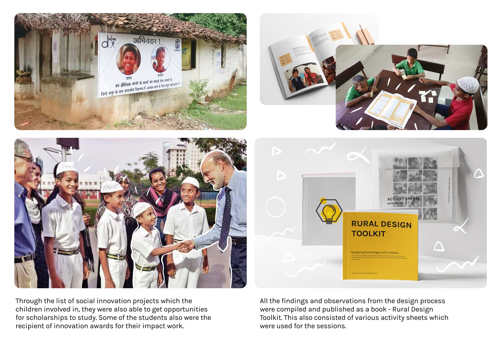
After seven months of lobbying, a one-of-a-kind children-led makerspace was established!
This provided the students with a platform for expressing their creativity. The students also actively involved with the community (farmers, artisans etc) and co-created solutions with them
A couple of our student innovators also got scholarships and were award recipients for their impact work. All these observations were published as a book titled ‘Rural Design Toolkit’. This was meant to encourage all our young grassroots innovators :)
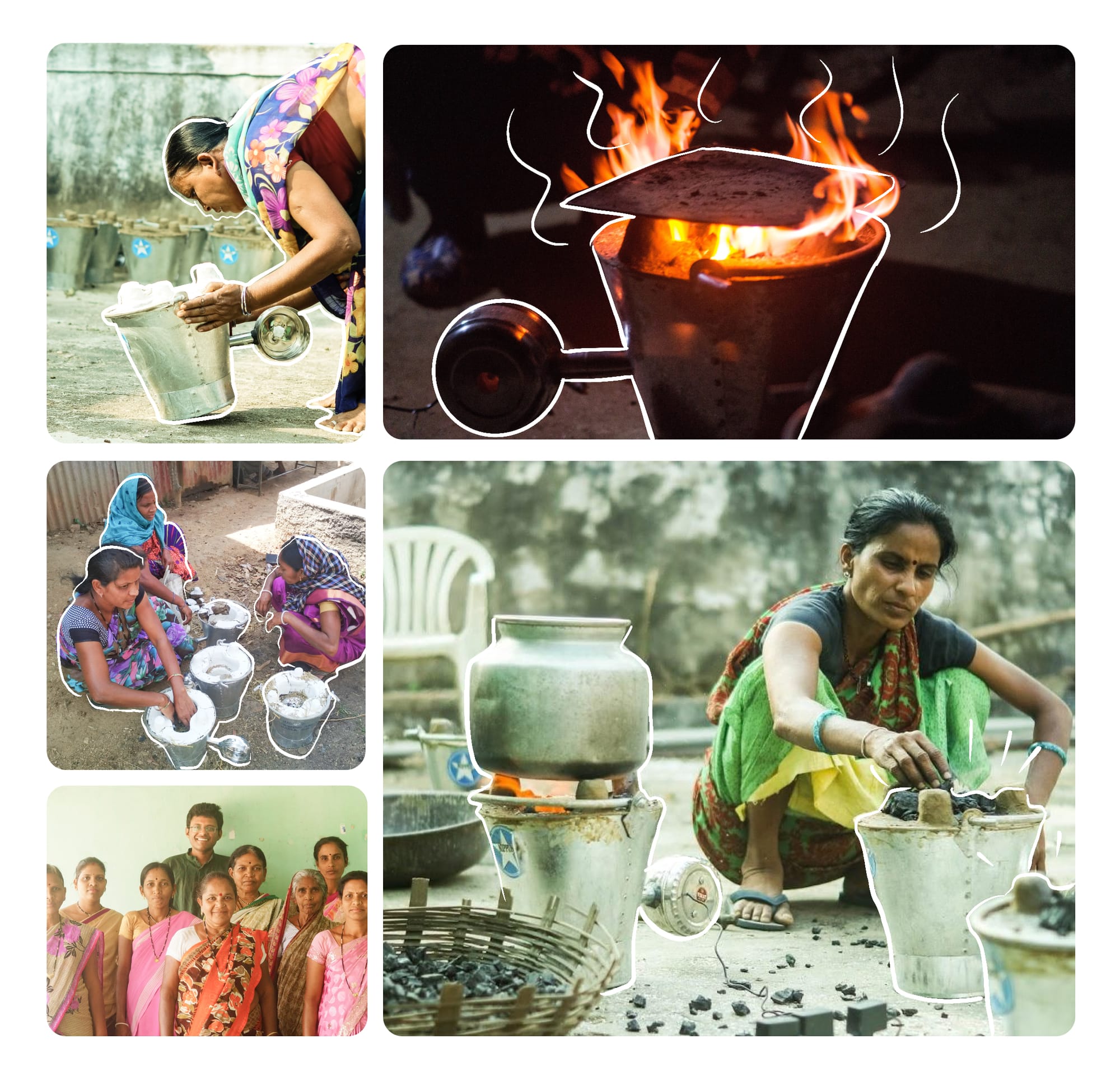
One of the innovations (smokeless chulha) also achieved significant maturity for taking it forward in terms of production. A group of 8 women members formed a team and were trained by the student innovator to take it forward as a social enterprise.
The systemic shift is still quite a hefty word. More than the innovations and the enterprises formed, the mindset shift which we observed is what we are the proudest of. From ‘What can the government do for us?’ to ‘What can we do for the community?’